Table of Contents
Level2 screens
In the Level2 there is a minor difference of the screen concept from that one in the WebHMI:
In the WebHMI, you can change screen layout right on the screen page, while in the Level2 you make screen layout on a special Manage page, afterwards you can only change the properites of the widgets from the screen view, not detailed settings.
Adding a screen
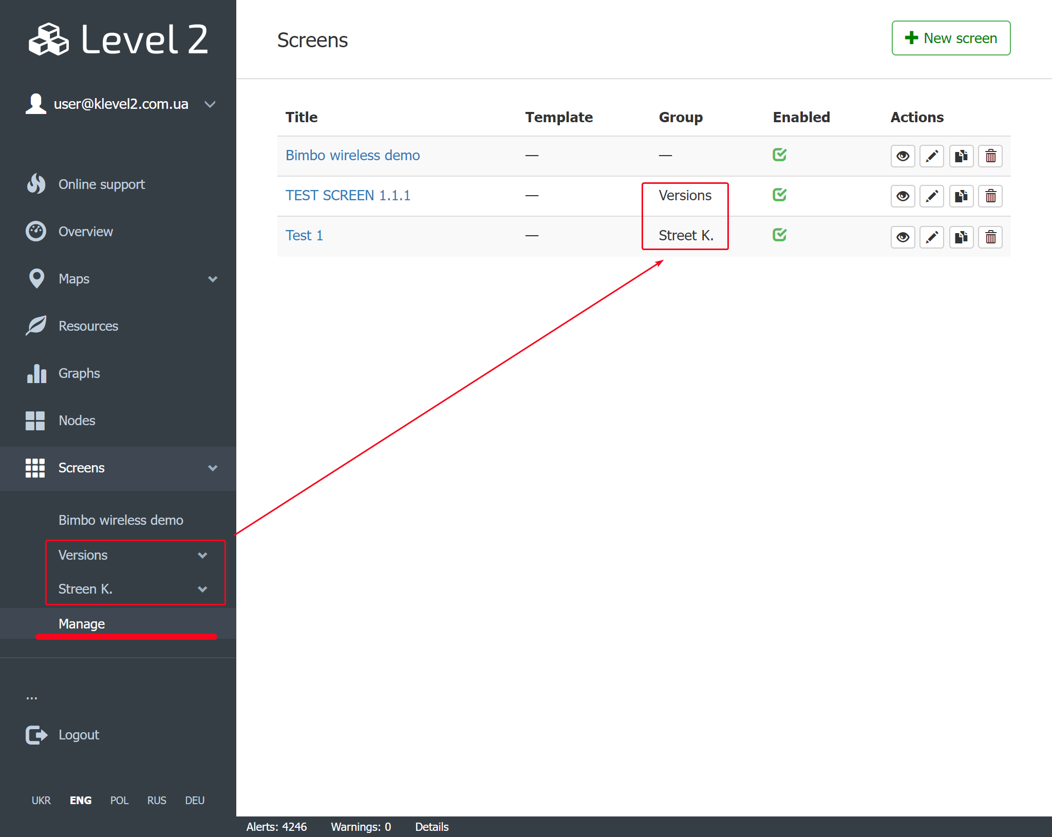
You create new screens in the side panel Screens/Manage sub-menu with a +New screen button:
 |
By clicking the screen's title or  button you'll get to the screen edit page.
Template means that the screen was cloned with keeping binding with the parent screen. Then in the cloned screen the parent's name will be listed in this column. Read more in the further article.
Group property wraps a set of screens belonginng to it into one side panel pull-down sub-menu.
Enable property switchs the screen visibility in the side panel on or off.
Editing screen's properties
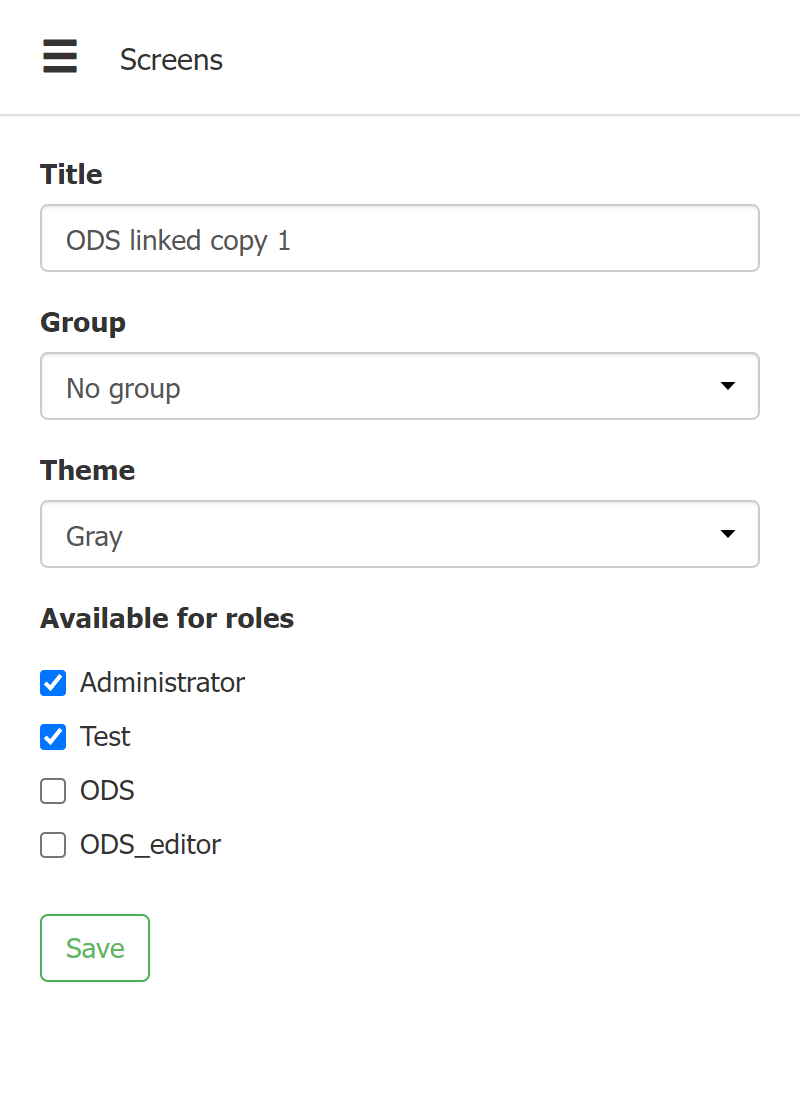 |
- Title - a name the screen will be listed with
- Group - see previous paragraph
- Theme - 2 options are available (Gray, White)
- Available to roles - who mays to access the screen
Editing screen visual layout
By clicking the screen's title or button you'll get to the screen edit page. Then by dragging & dropping & setting up available widgets onto the screen page you can create your screen layout.
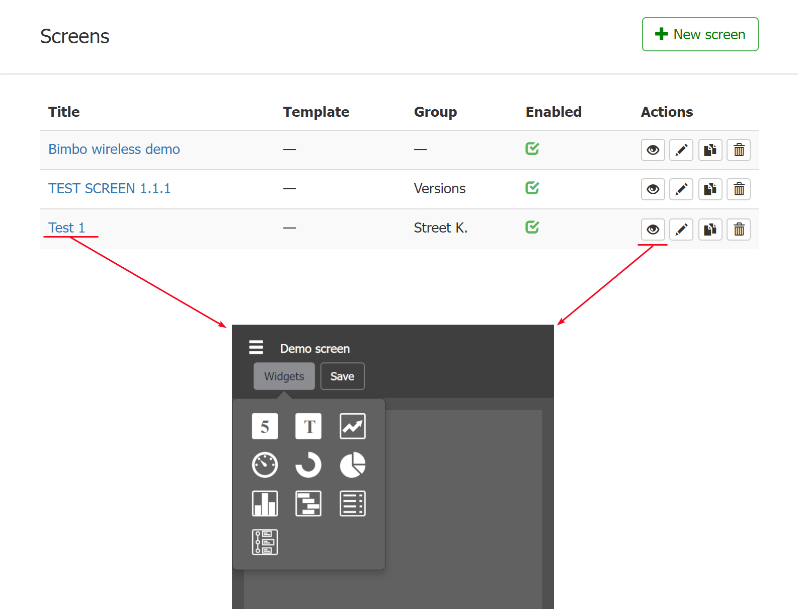
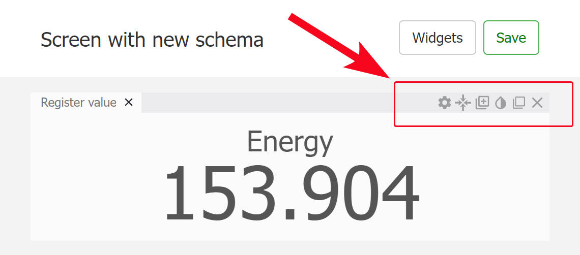
Level2 screen widgets
Every widget places on a screen has several common controls to adjust its appearance. They are located in the top right corner of widgets.
 |
The setting up otions for the widget are given in the following short video:
 |
The Setting  control is individual for a widget type while others are common for all widgets.
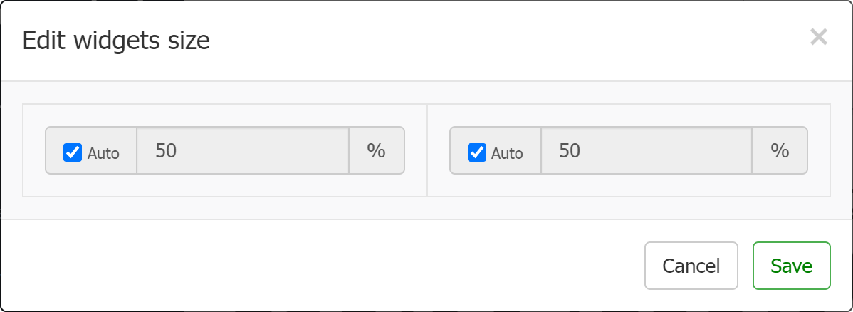
Widget size control
You can select either auto or specific size in % the widget will occupy on a screen page.
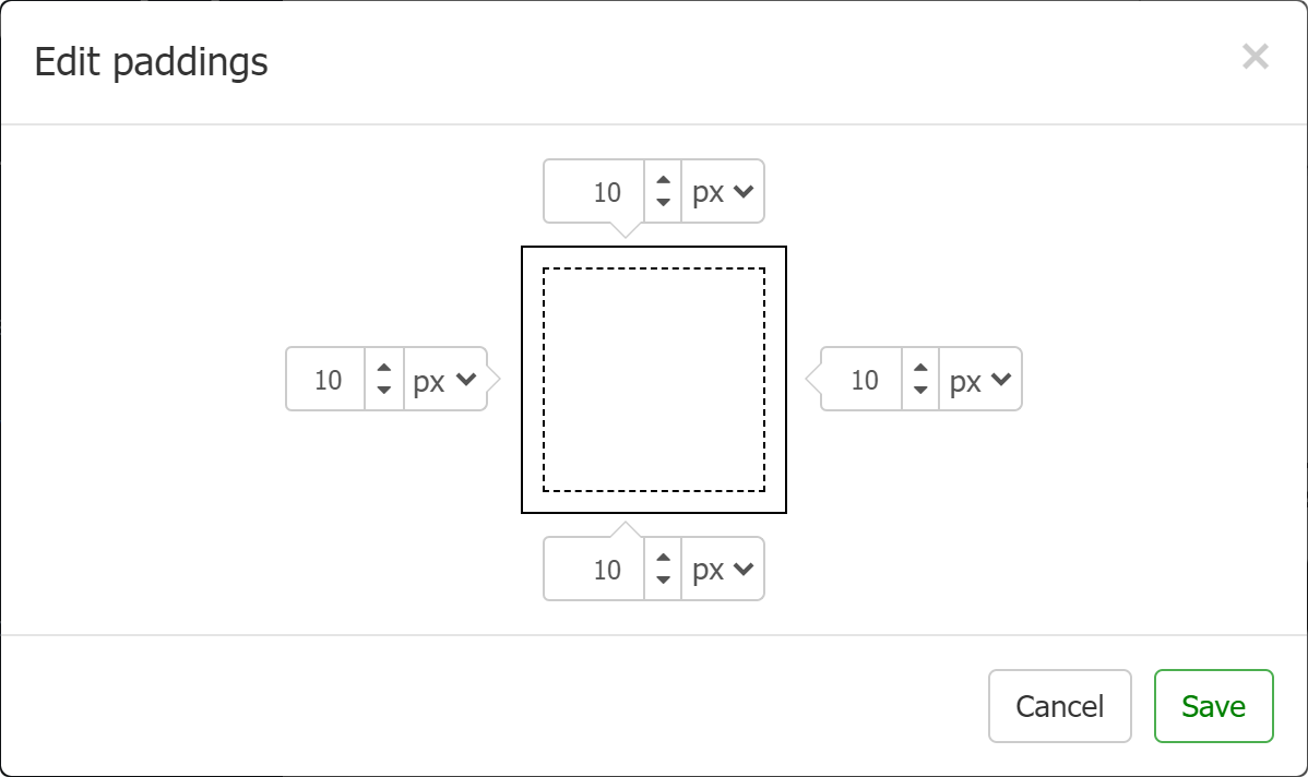
Paddings
You can adjust paddings for the widget content inside the widtet:
Copy tab
Makes a copy of the selected widget.
Background color
Quick color picker to select background color for the widget.
 |
Open widget in a new window
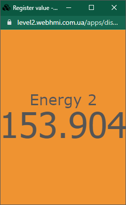
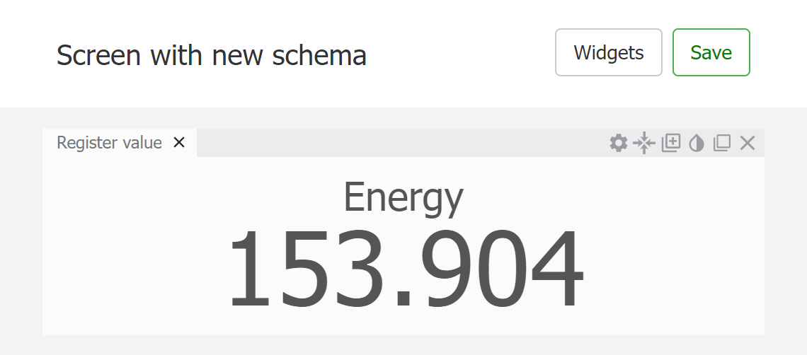
Register value widget
This widget shows just a value from the register:
 |
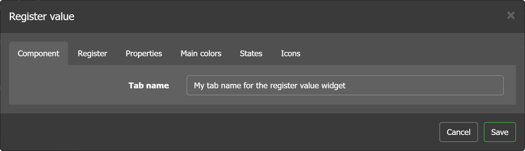
Press Settings control to edit the widget content.
Component tab
Is for setting a title.
Register tab
In this tab to bind the source of the data, i.e. register to the widget and set data format:

Value type
You can show the value “as is” or represent it as a time value. For the latter two options are available - time or duration.
Measure units
The units will be appended to the value (right to it).
Link
Upon clicking on a register value with a link set, you will be forwarded to the link URL.
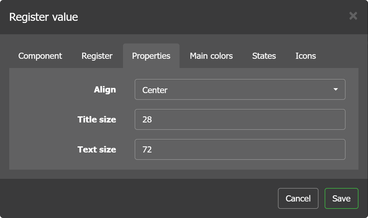
Properties tab
In the register value tab, the tab are actually alignment properties. For align there are 3 settings: left, center, right.
Main colors

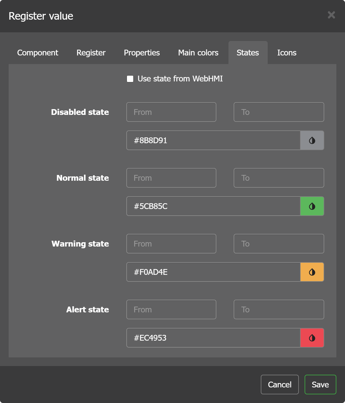
State
The states for the register can be either derived from the states of the register value which was sent to the Level2:
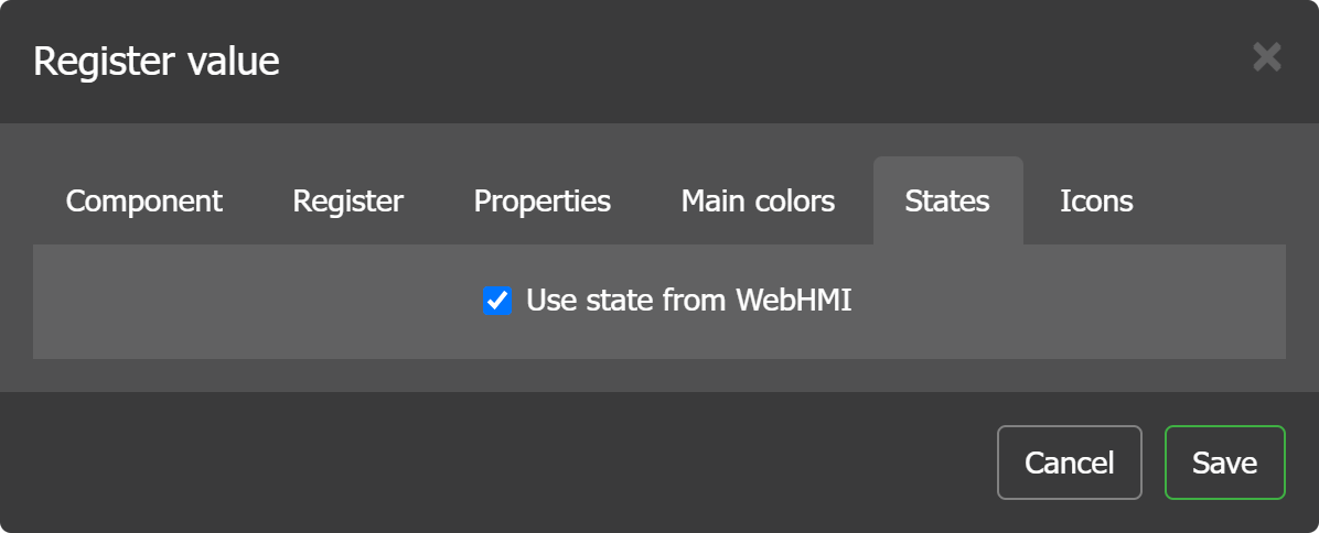
or redefined (the rules are the same as in WebHMI registers state setup):
Text widget
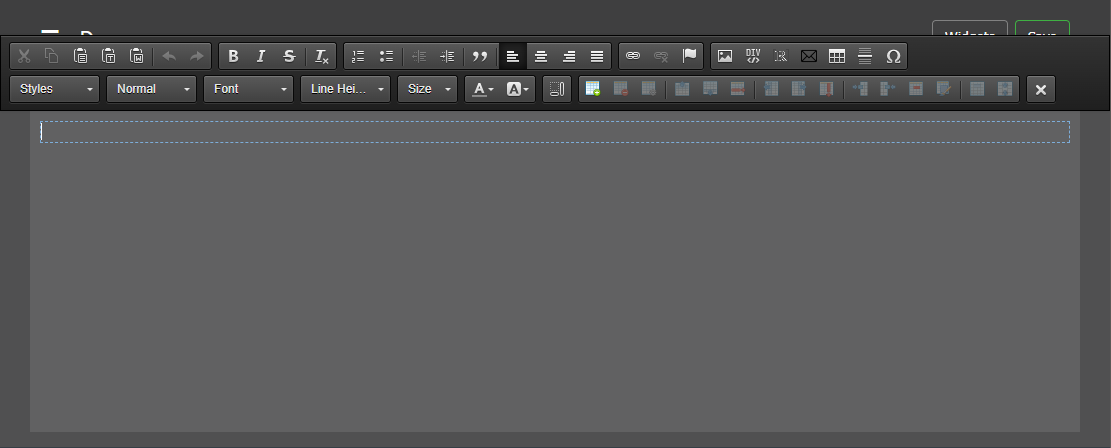
With this widget you can add rich-formatted text blocks including real-time values with option to change format based on registers' values.
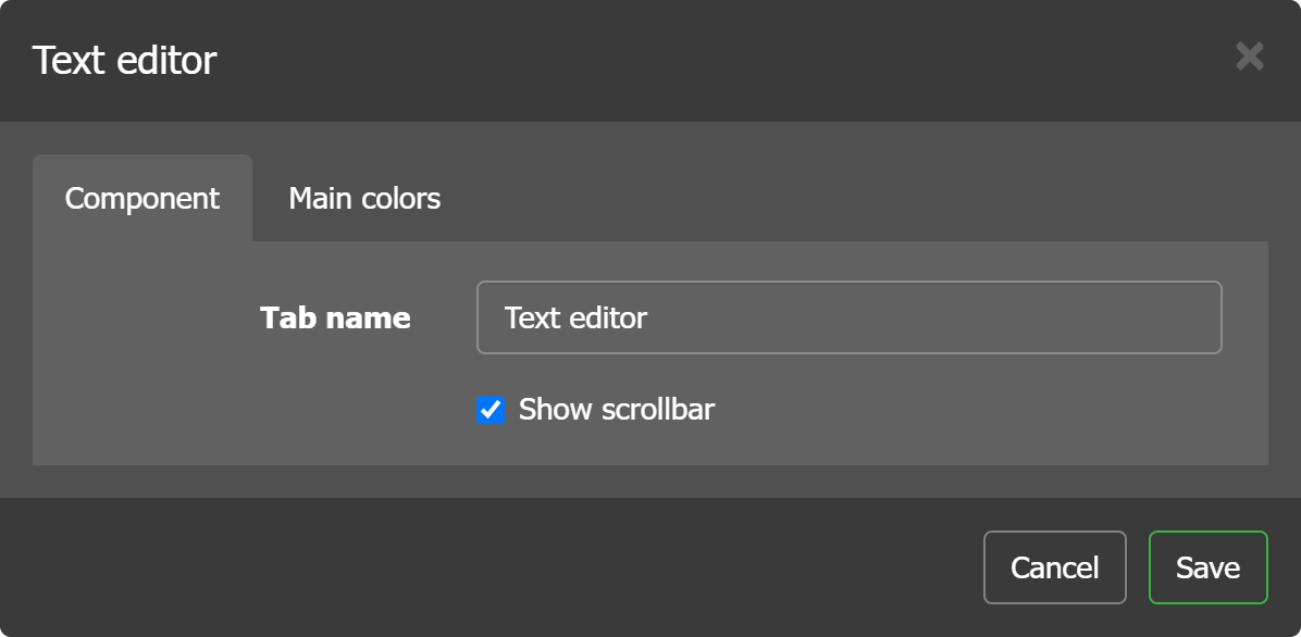
The widget has few settings (show scrollbar means the one inside the widget):
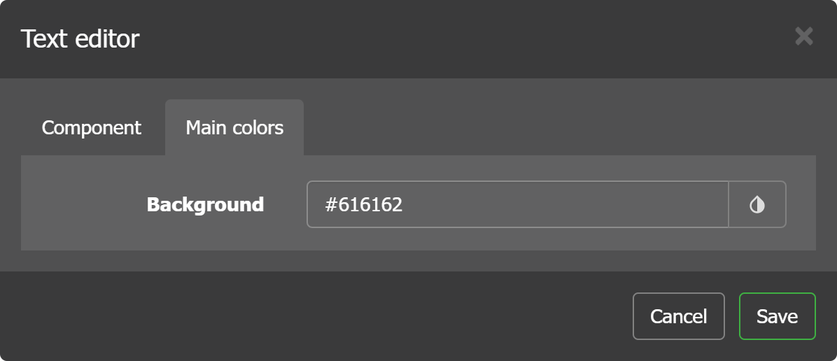
as well as a background color to select:
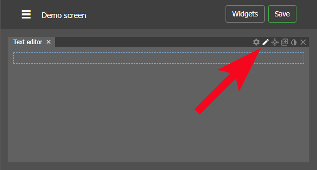
In the widget settings you can invoke a text editor by pressing this:
Then a full toolbar will pop-up: