Table of Contents
Screens
Screens are available since 3.6 fw version. They allow you to arbitrarily compose content placed in separate frames, simply dragging the mouse over their borders, changing position and scale, quickly add, delete or copy objects.
These feautures gives many advantages over bulky dashboards where you had to put everything together in one workspace. Now you can create several simple dashboards, graphs, tables and diagrams in the form of separate blocks (widgets), folding them into a flexible functional interface, like cubes.

Creating and managing screens
The screen setup can be accessed from the main setup menu, which is invoked with a '~' hot key or via the button in the top right corner of pages.
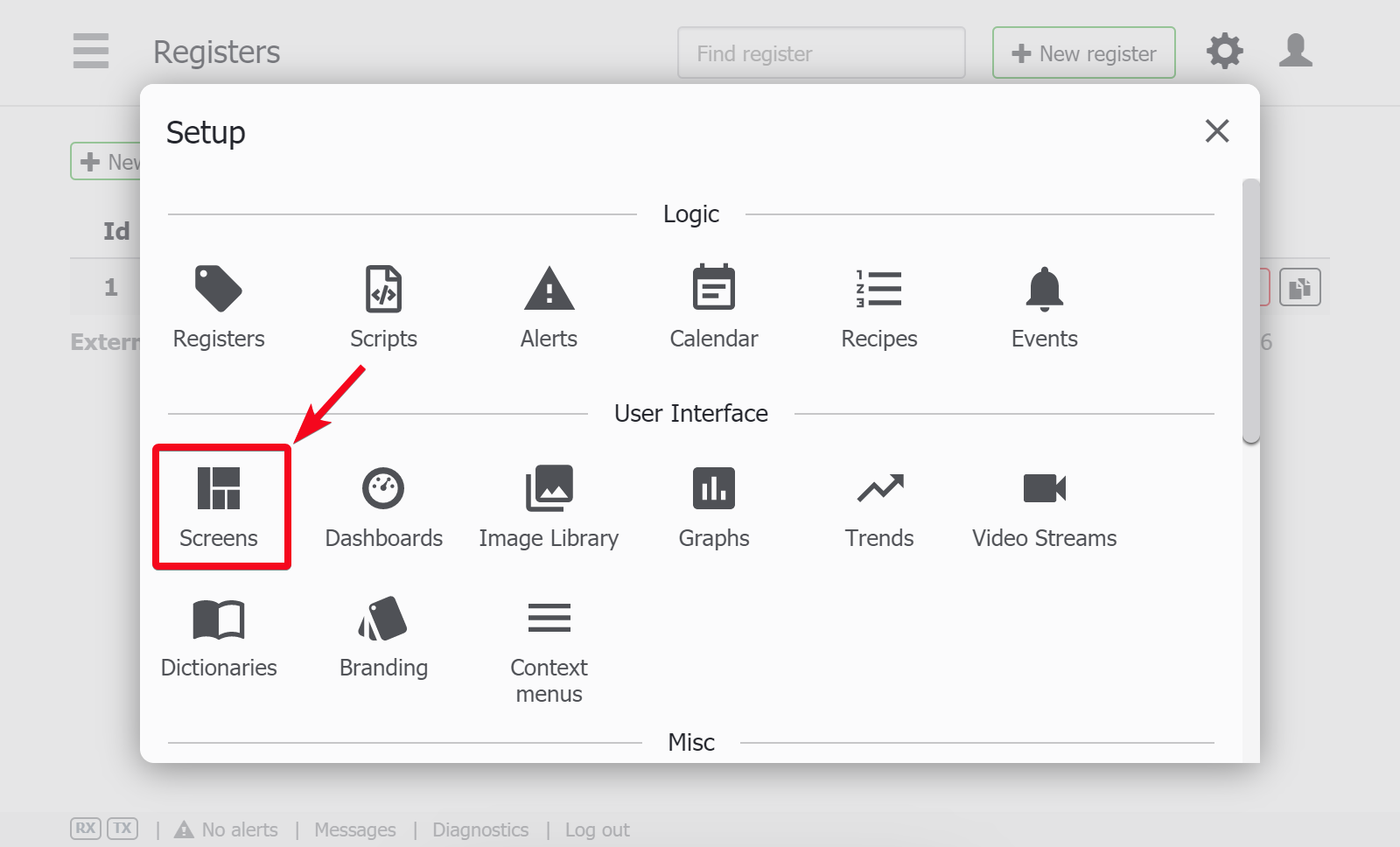 After clicking the icon, you get to the list of the project's screens.
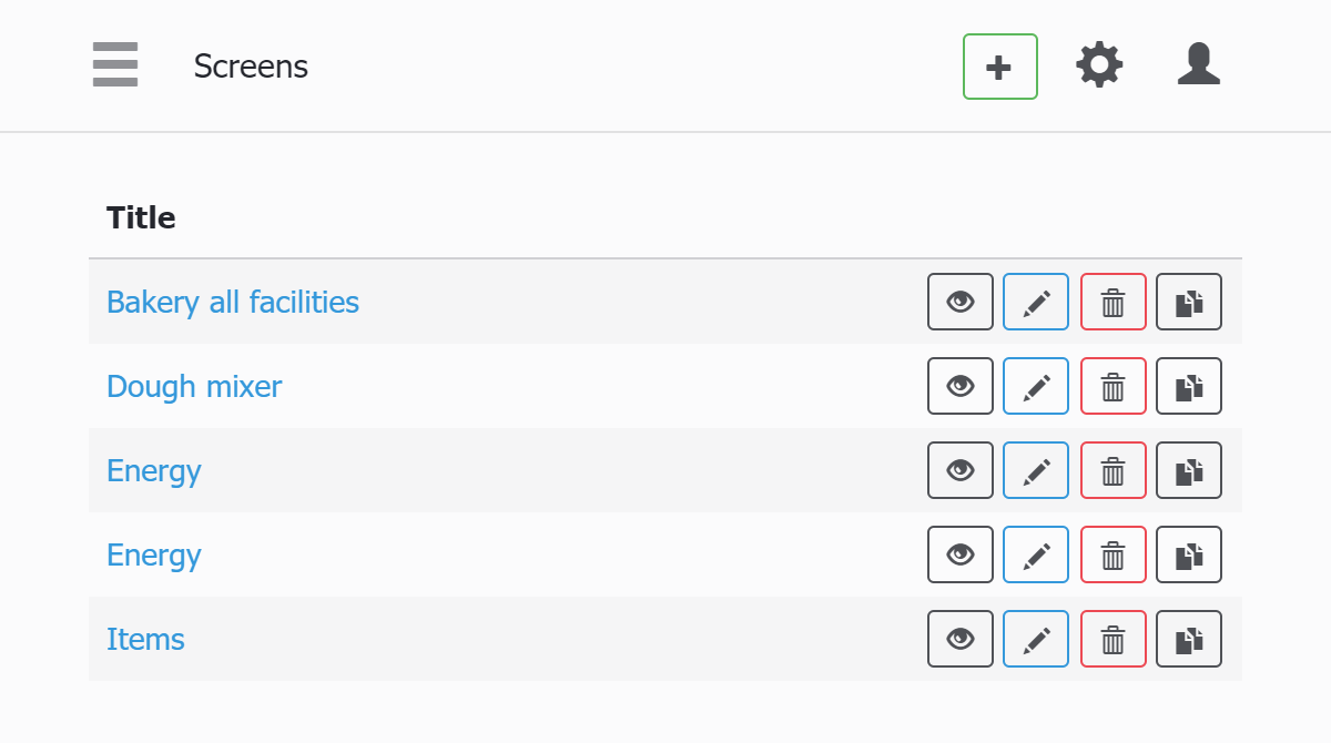
- + Button adds a new screen
- View, Edit, Delete, Clone actions corresponds to the buttons in their order (Edit action is also done by clicking on titles).
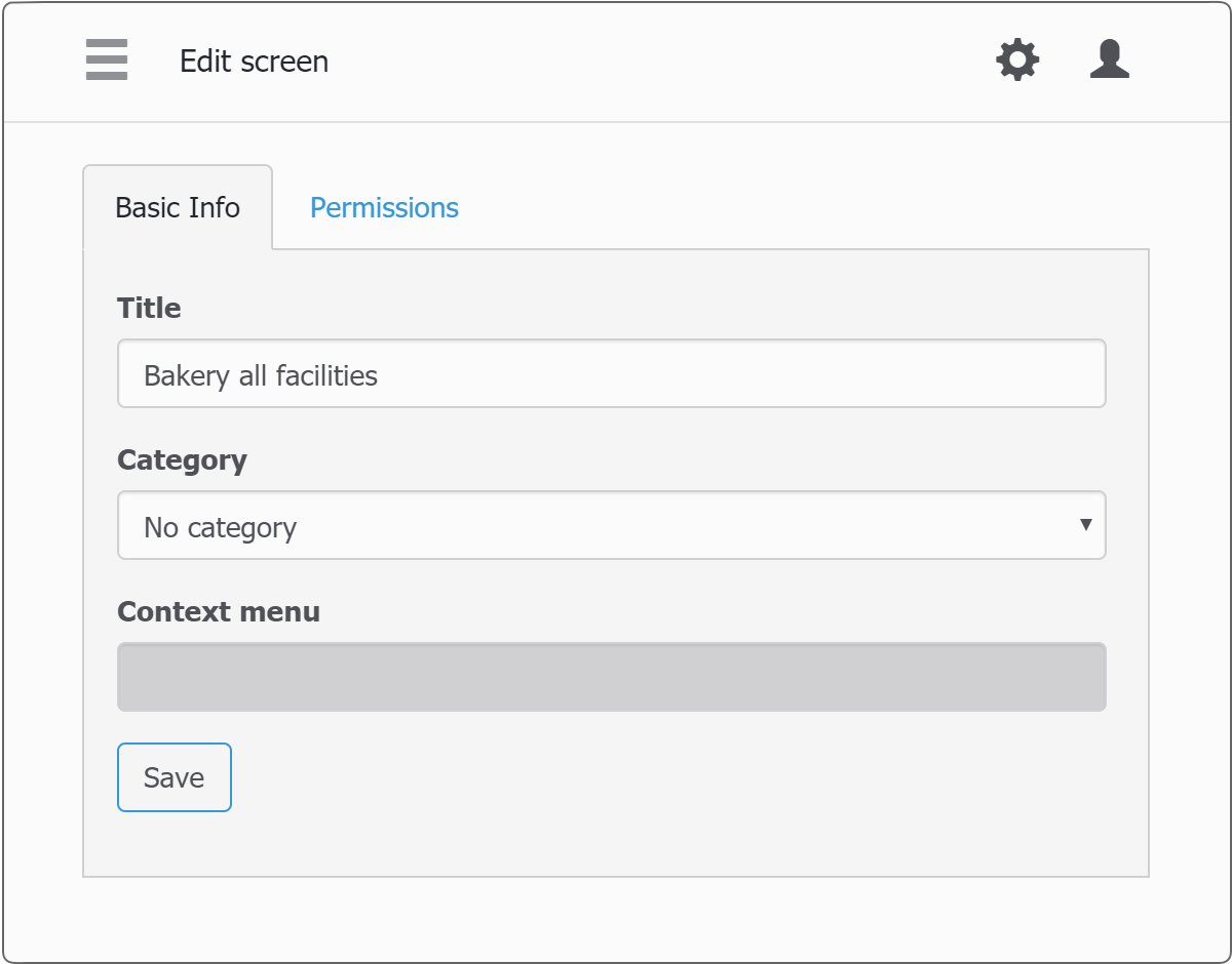
Screen properties are grouped in two tabs - Basic Info, Permissions. For the basic settings:
- Title - set the name for the screen
- Category - put the screen inside the category in the side bar
- Context menu - select the context menu (if present) to be viewed on this screen
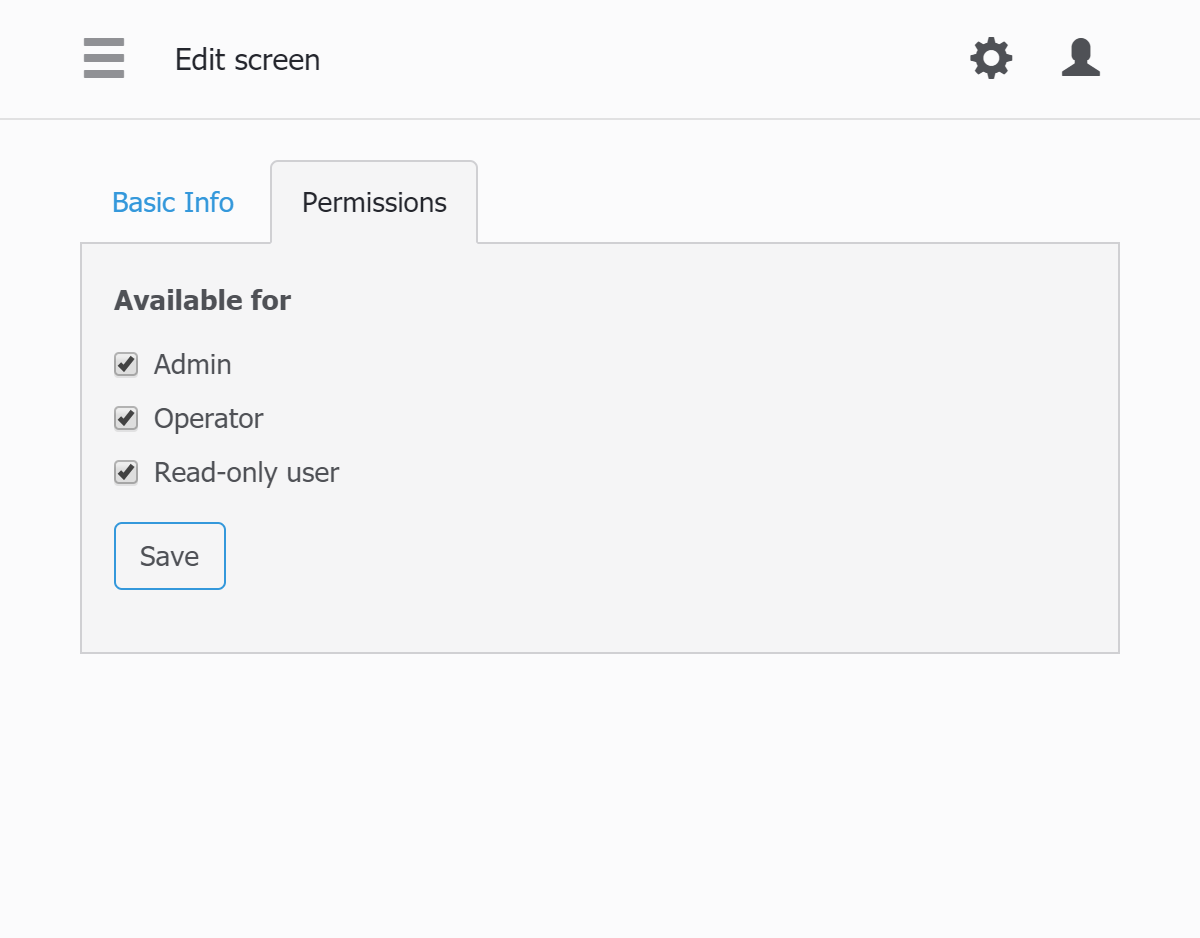
In the permissions tab you select the users who can access the screen.
Screen visual setup
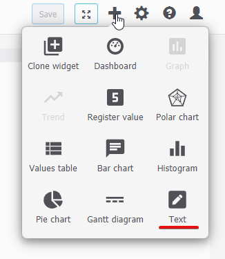
When you get to the screen view, if you have the priviledge of editing screens, you can add widgets with a + button.
The main screen setup details are following:
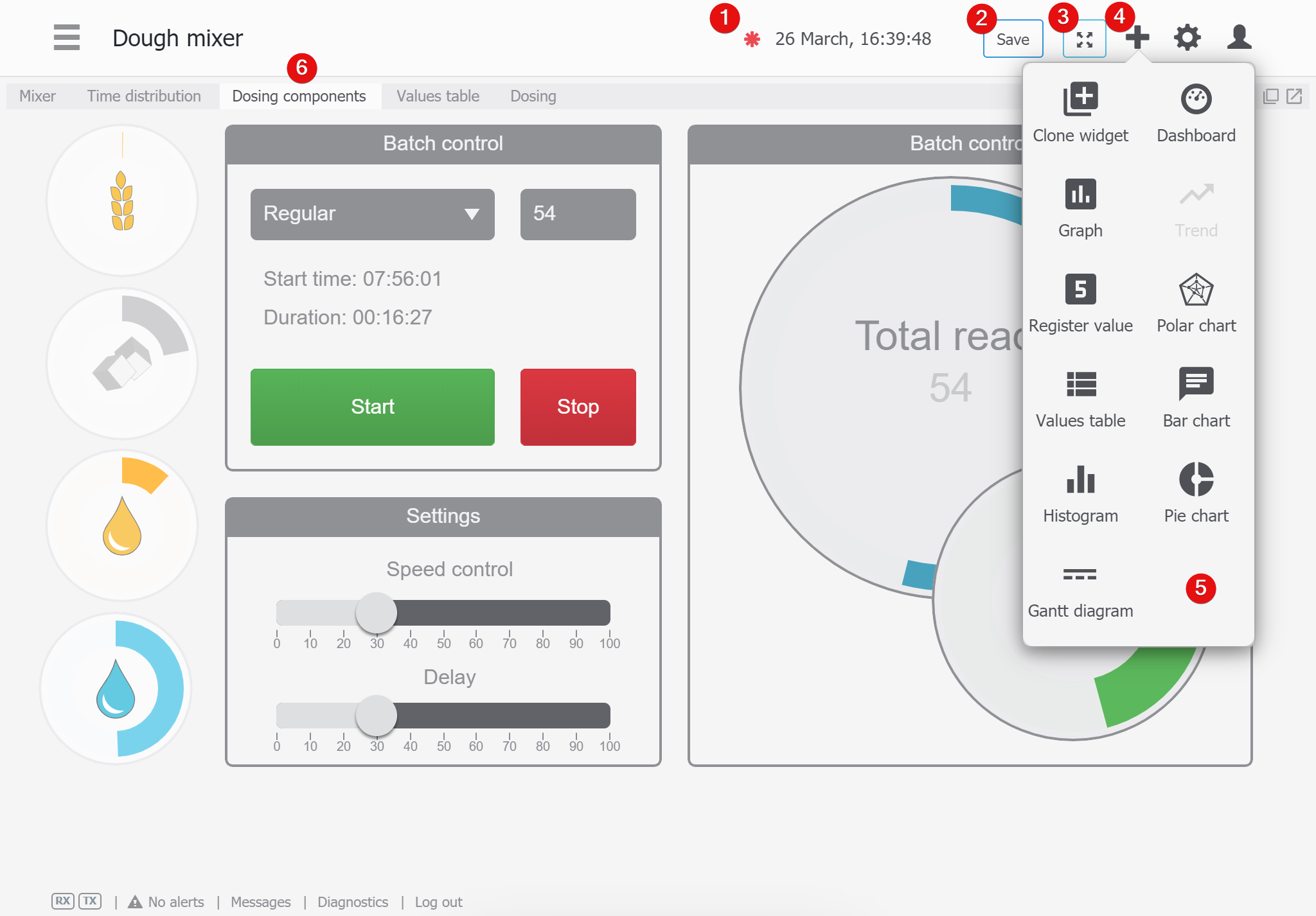
- “Unsaved changes exist” mark.
- “Save changes” button. You can also press CTRL-S.
- “Expand view” button.
- “Add widget” button.
- Widget selection pane.
- Screen elements (widgets, dashboards) organized into tabs. This can be done during setup or when the large screen is viewed from a small display, the screen elements automatically line up in tabs (temporarily).
Adding elements to screens
It's just that simple: you drag the element from the widget selection menu and place it onto the screen. In the following example, 3 elements are placed onto the screen area: dashboard, widget, and graph.

Each widget is placed in a frame which can be further adjusted - in size, location, and content properties (which depend upon the widget type).
Frame adjusment
Each frame is adjusted using the following:
- Title tab. It shows widget or dashboard title, and serves as a handle for dragging element into new place.
- Align to width micro-button. When pressed, all frames on the same horizontal axis become of equal width.
- Widget setup micro-button. This will be explained in their respective sections below.
- Background color picker.
- Open frame in new window.
- Maximize frame. After that this micro-button become “__” (Minimize) to go to previous view.
Widgets
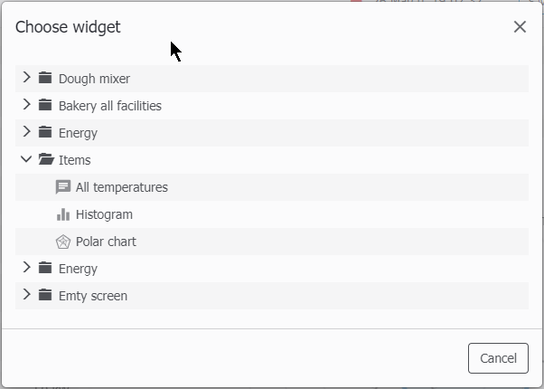
Clone widget
With this widget, you can lay down the widget that is already present in the project. The dialog window will be shown with the list of available widgets grouped by their parent screens.
Dashboard widget
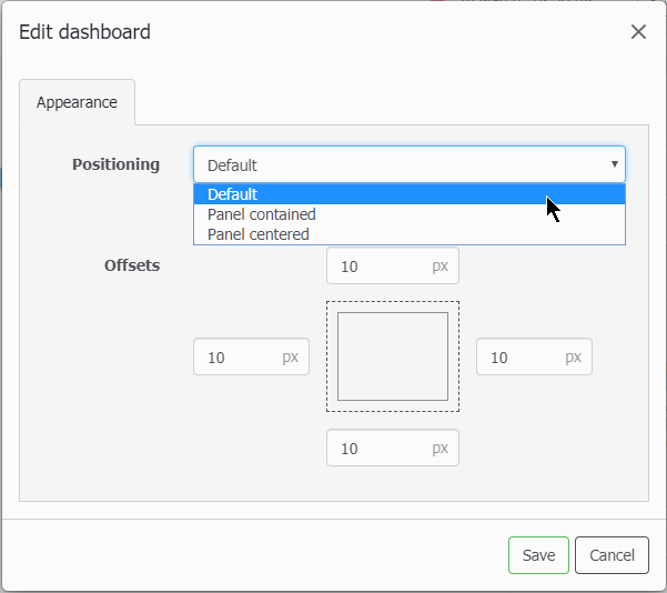
Please refer to dashboard editing section for details. The dashboard has the following settings:
- Default. The dashboard will be placed in the original size, align to left-top. If it does not fit into the frame, there is an option of enabling Scroll in the frame
- Panel contained. The dashboard size will be automatically adjusted to the frame size.
- Panel centered. The dashboard will keep its size but align to the frame center.
- Offsets are the respective gaps between dashboard and frame edges.
Graph widget
If there is a graph configured in the project, you can emded it into the screen, adjusting some details.
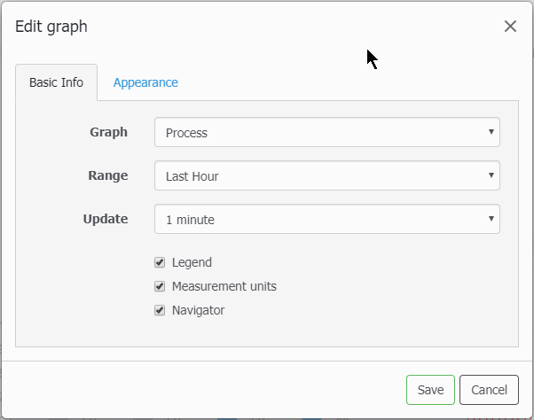
- Graph - select existing graph
- Range - select time span for the graph hour, 24 hour, today, yesterday, last 7 days, last 30 days
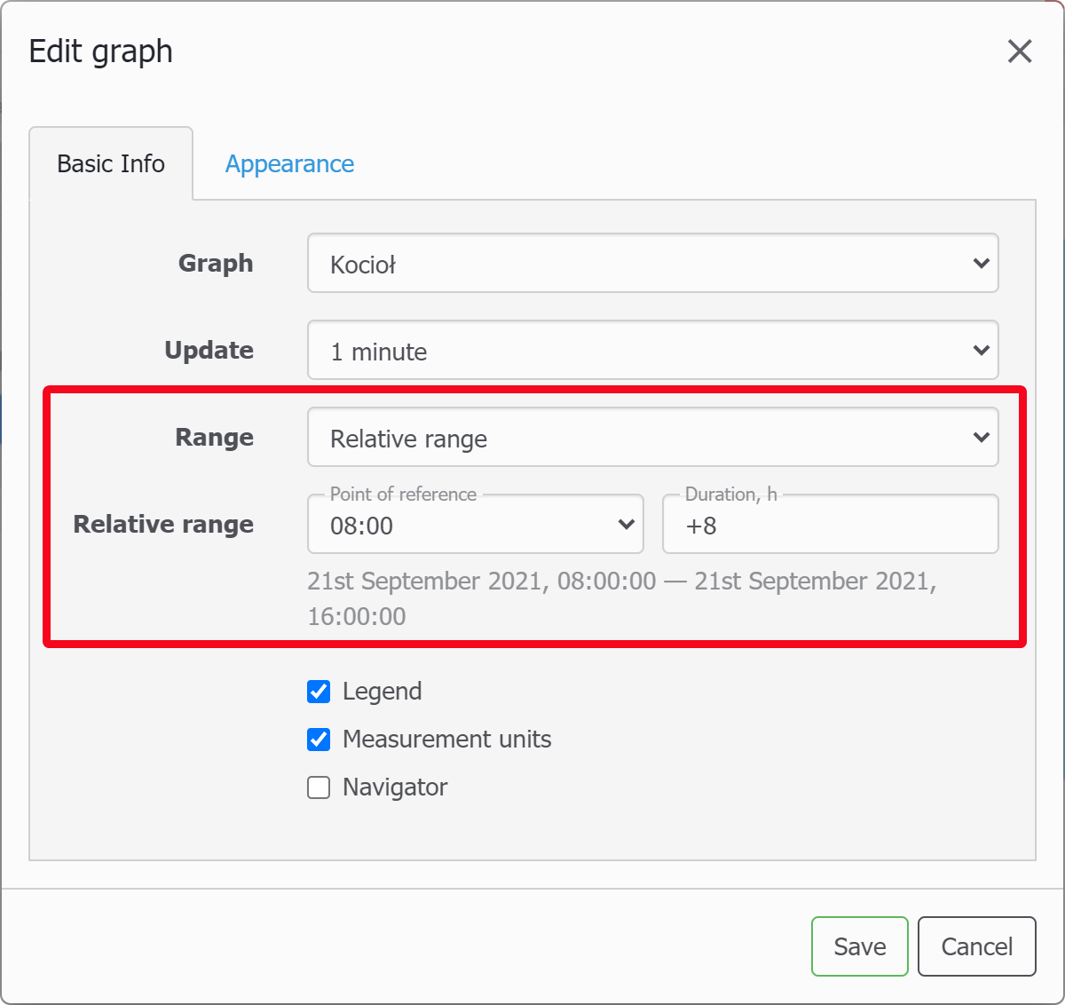
As of fw 4.0.7139 version there is a relative rime range method available:
Sometimes you may be interested in a non-standard time interval on the widgets of graphs or Gantt charts, which is absent in the standard calendar, for example, the shift starts at 11 o’clock and you want to watch -8 hours relative to this moment.
- Update - select update rate from the following options: 1, 2, 5, 10, 15, 30 or 60 minutes
- Legend, Measurement units, Navigator checkboxes show/hide respective details of the graph
The graph widget always occupies full frame area and in the Appearance tab you can only set offsets from the frame's borders.
Trend widget
The trend widget is the same as Graph except for 2 attributes:
- there is no Navigator slider, becuase a trend is a real-time view always from current time back to the span set
- there is no Update rate selecton becuase the trend updates regularly based on the global interface refresh setting
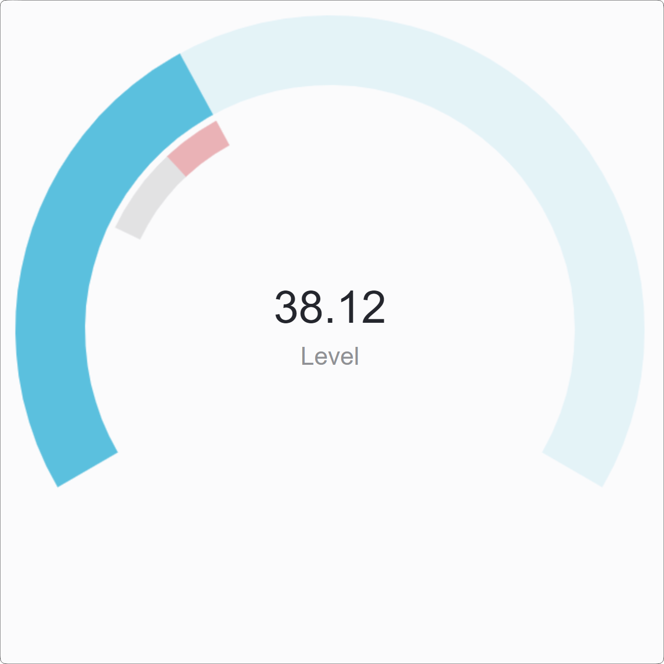
Register value
It shows one register value, especially useful when you want to show it large to be seen from far.

Following are the settings for the register values:

Appearance: it can either window-centered or alighned to left/center/right with offsets.
In the 4.1 fw there was a change in this widget:
Trend indicator in the value widget
The current value widget for screens now can show rising or falling tendency of the value shown referenced to an average value for the period. In the widget settings respective parameters have been added: averaging period and colors for the rising / falling tendency.
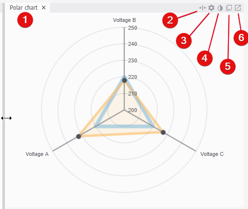
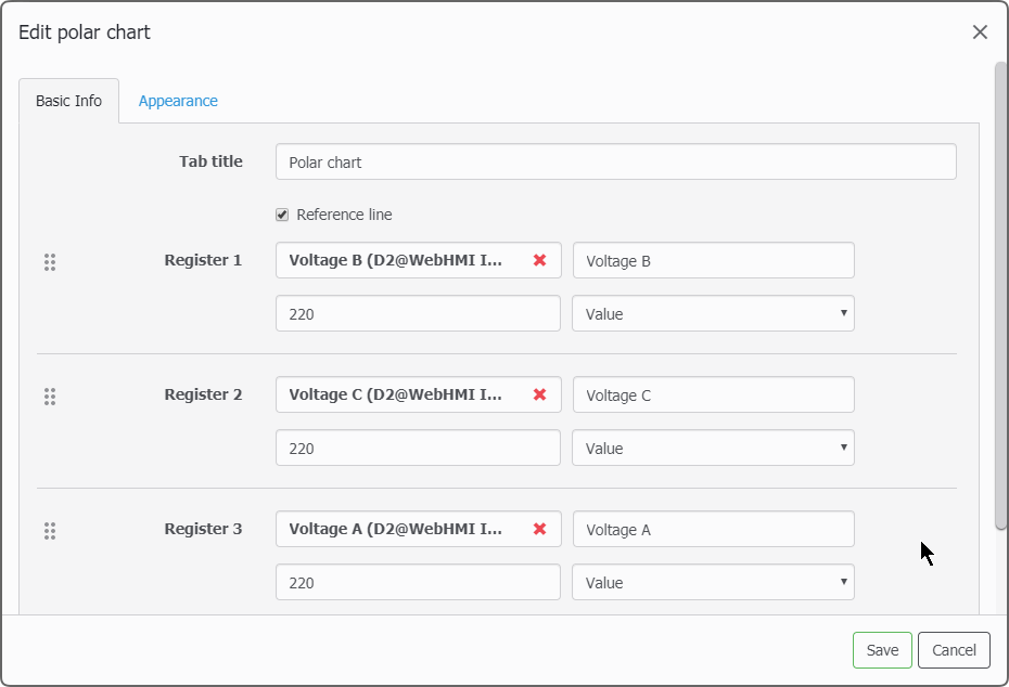
Polar chart
The polar chart is useful when you need to detect unwanted skew in the normal “pattern” of values.
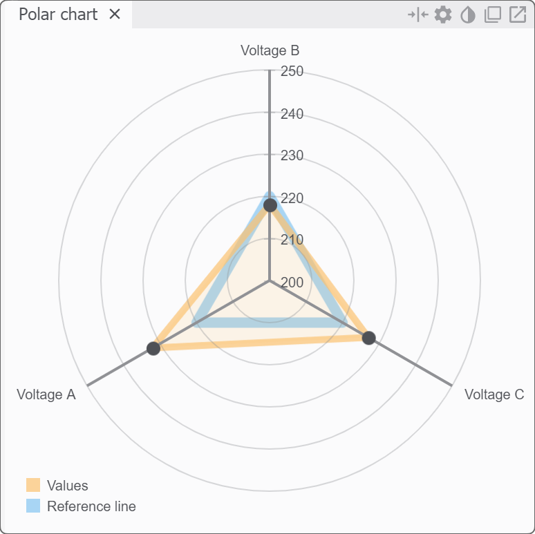
In the Basic tab setting you can set the name for the widget, set values with their names and choose the reference line to judge the values.
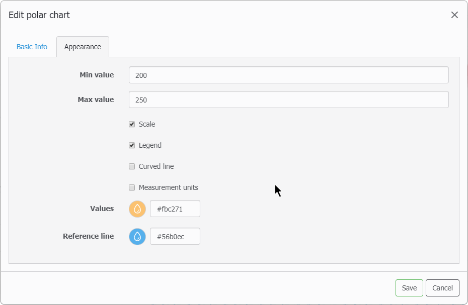
In the appearnace tab, you can select value range for the axises, wether or not to show scale marks, legend, curved or straight style for the reference line, meausurement units and colors for the reference line and values.
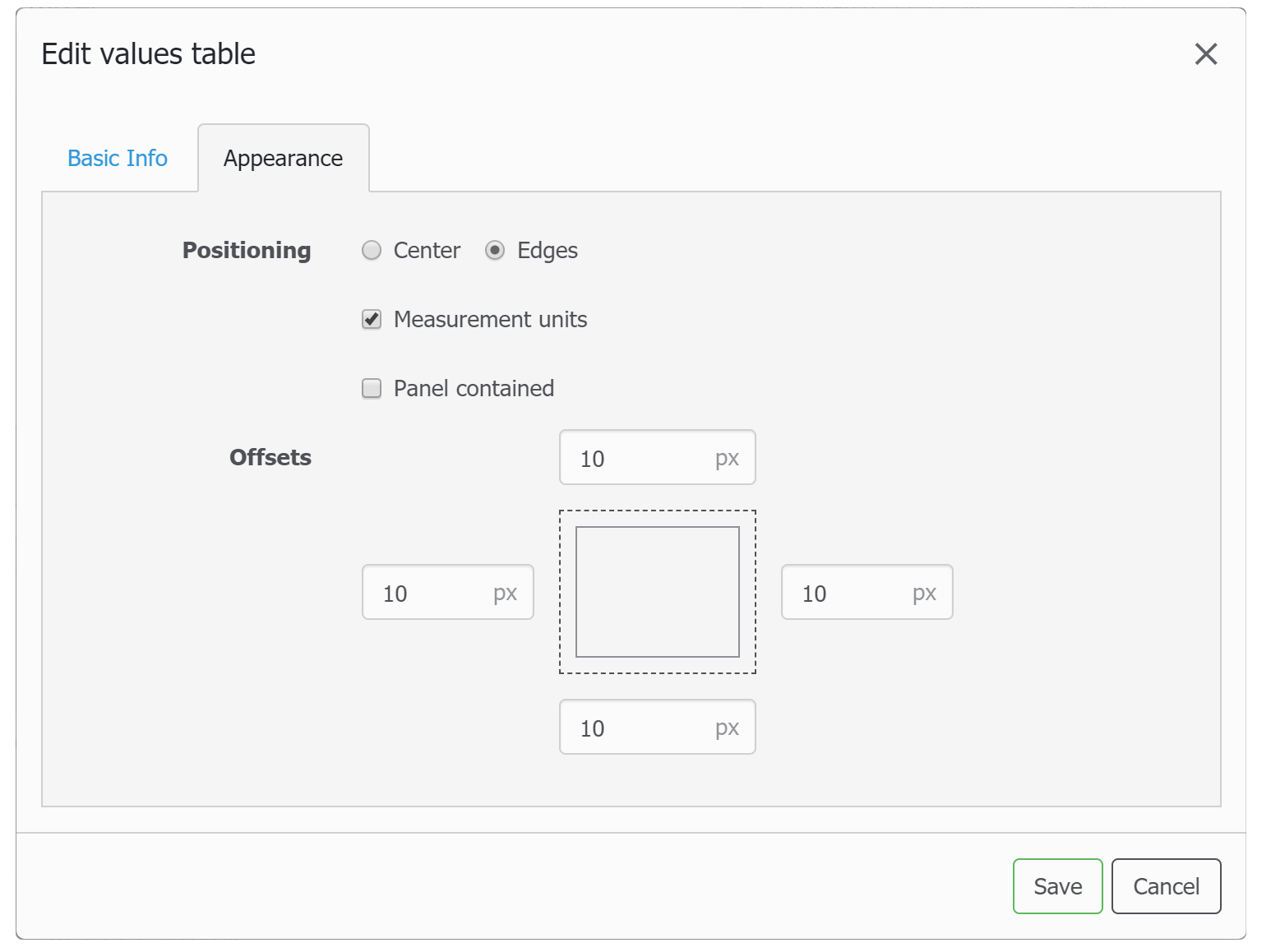
Values table
The values table is just a list of the registers you want to view or change their values (these have dotted underline).
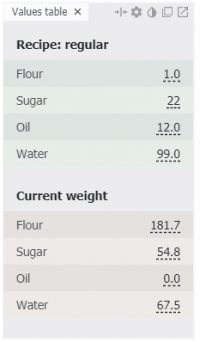
You can add dividers (headers in bold text), rename register titles as they should be in this table, arrange registers in the list, colorize them according to their states.
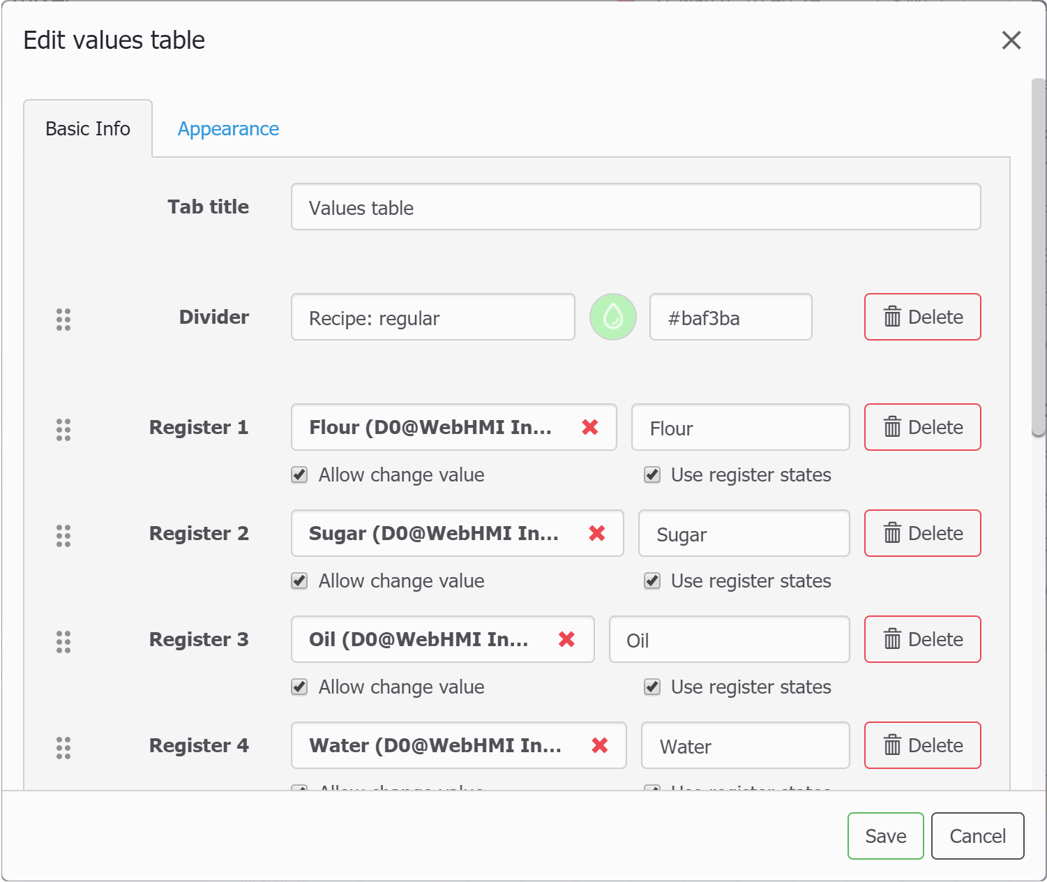
In the appearance tab, you can choose if the text in rows is center- or width aligned, have the measurement units, and if the whole widget is fitted into the frame or keep its size (for latter side offset fields are available).
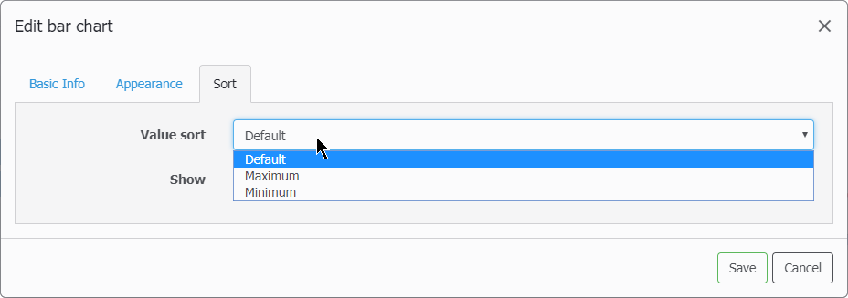
Bar chart
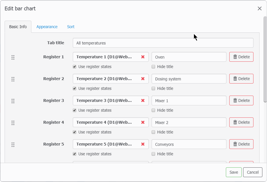
The Bar chart shows a set of register values as horizontal bars.
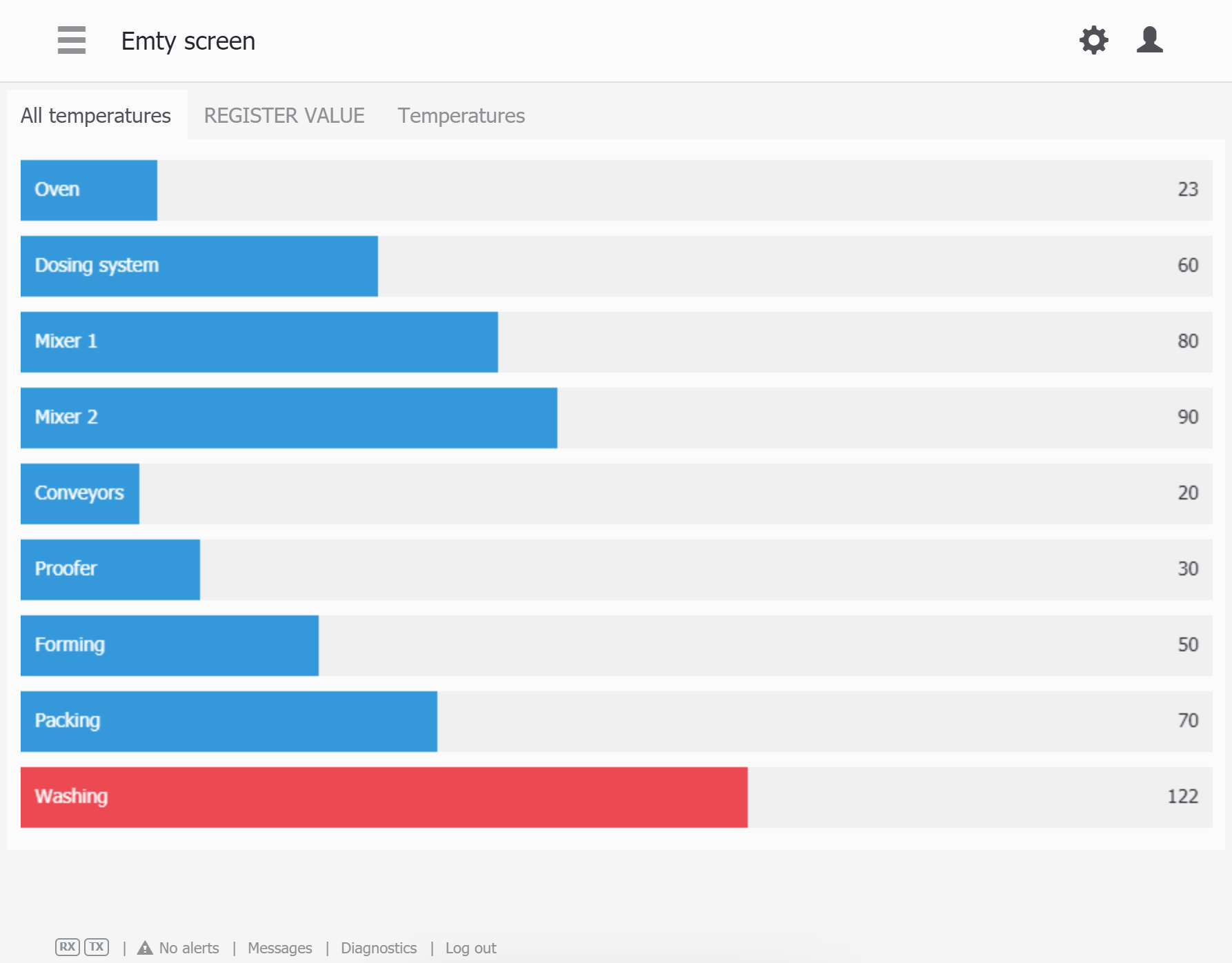
In the Basic tab, you can set titles for the the widget frame and registers, colorize values according to their states, and set the order of the registe list.
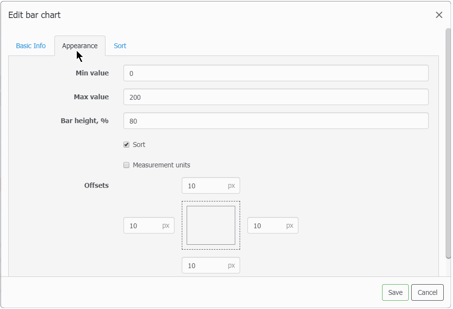
In the Appearance tab, Min and Max values set the span of the the register's value, bar height sets bar height percentage from the availabe total height distribution of each row. With the sort checkbox, you can choose asceding or descending bar order by the registers' values, or leave it by default (by the order in the Basic tab).
Hystogram
The hystogram is similar to the bar chart with minor differences:
- bars are vertical
- titles for the bars are shown as hints
- no sort option
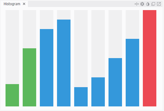
In the basic tab, you can set titles, options of colorizing the value accorging to the register states,

The Appearance tab is same as in Bar chart widget.
Pie chart
The pie chart shows relative shares of values in their sum.
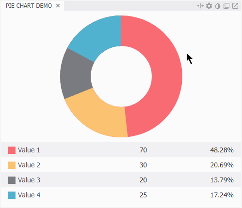
In the basic tab, you can set titles for the widget tab and registers, their color and order.
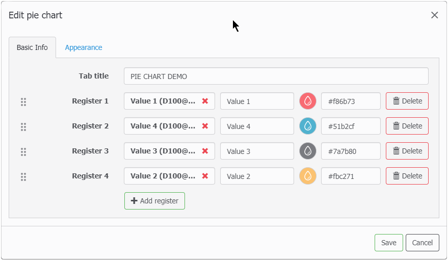
In the Appearance tab, you can choose options of legend & measurement units dispay, solid fill for the pie (Fill of 100%) or no, and content offsets of the frame border.

Gantt diagram
The Gantt diargam shows durations for a set for processes or states on a timeline.
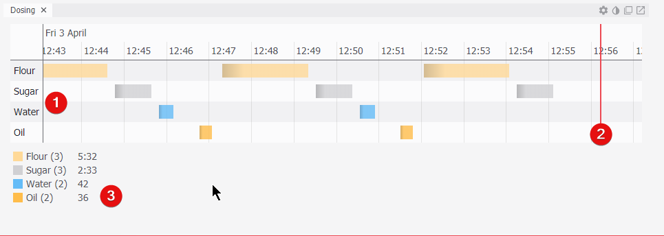
In the above figure:
- Timeline with state titles and their durations shown
- Current time mark
- Summary of state's indiviual total durations in the current view of timeline
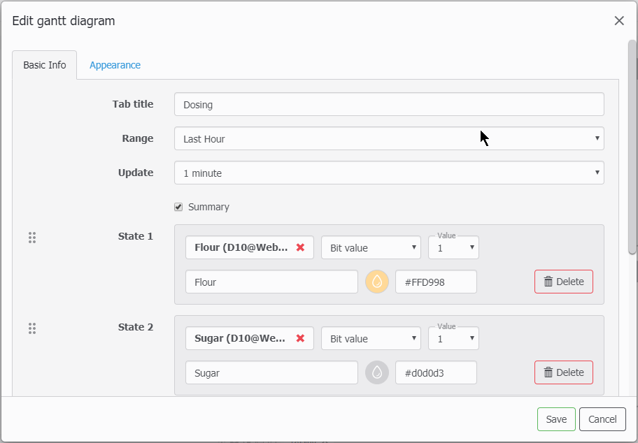
In the above figure:
- Tab title - says for itself
- Range - it the time range that will be shown on the Timeline upon page load. Aftewards you can zoom it using scroll wheel of the mouse. You can drag the view with your mouse too. Double-click will return to the original range.
- Update - update rate for the widget
- Summary - this checkbox toggles visibility for the summary
- State - this sets process states' title, color and the condition for a process state as existing (running) or no. For the bit tags you can only select 0/1, for others - 4 conditions of =, ≠, <, >.
Text widget
There are 2 versions of the text widget - basic one and extended, the latter can be downloaded as a DLC component. To download the new DLC components, just go to the About page. With internet connection present on WebHMI they will be downloaded automatically.
To add the text widget on the screen, select Text widget on the screen widgets pane and drag it onto the screen area.
This a rich Text/HTML editor where you can add real values from registers using two tools:
- Register value ( use
{{R<id>}}notation to insert the register #id value, add '*' to be able to change the value)
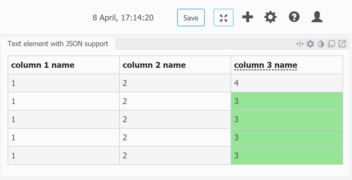
- JSON value - this value will be automatically converted to table according register's content.
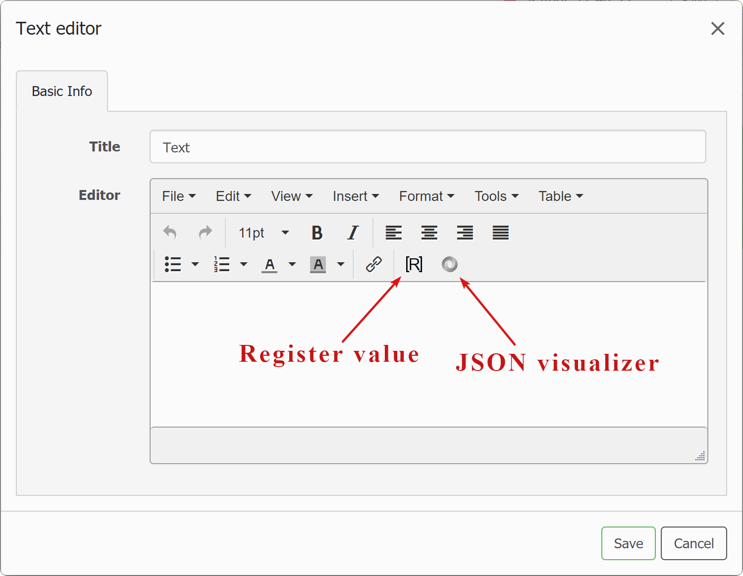
JSON visualizer
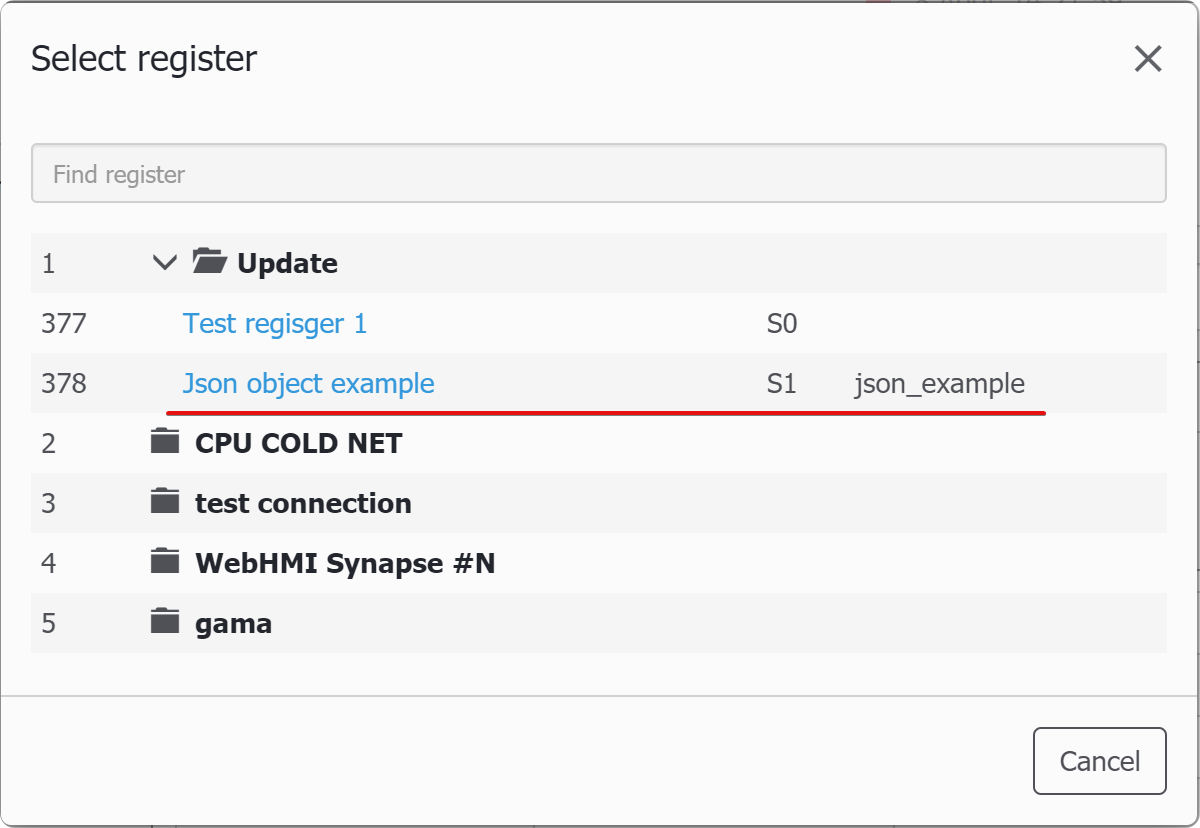
To test JSON feature, you can use a register of a String type, and lua script, which generate required structure. Or you may paste JSON string right into the register while setting its new value.
function main (userId)
  local cur_json = R("json_example")
  local new_tab = {}

  if (#cur_json <= 5) then            -- first call
      for rows = 1, 5 do
          local column = {}
              for col = 1, 3 do
                  column[col] = col
              end
          new_tab[rows] = column
       end
   end
   tprint(new_tab)
   local s = cjson.encode(new_tab)
   W("json_example", s) ; INFO("now tab = " .. s)
end

function tprint(t, indent)
    if not indent then indent = 0 end
    for k, v in pairs(t) do
        local formatting = string.rep(' ', indent) .. k .. ': '
        if type(v) == "table" then
            ERROR(formatting)
            tprint(v, indent + 1) -- recursive call
        else
            if type(v) == "boolean" then
                v = v and "TRUE" or "FALSE"
            end
            ERROR(formatting .. v)
        end
    end
end
Make sure you select string register which contains string representation of the table, otherwise you'll get warning that json is geterogenious.
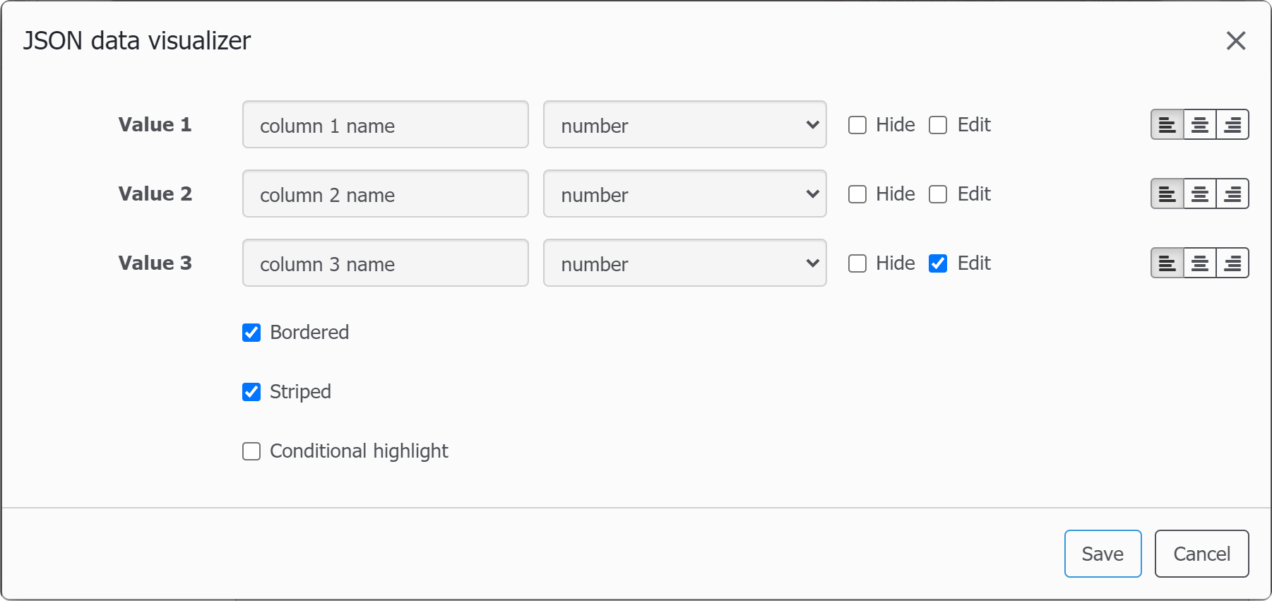
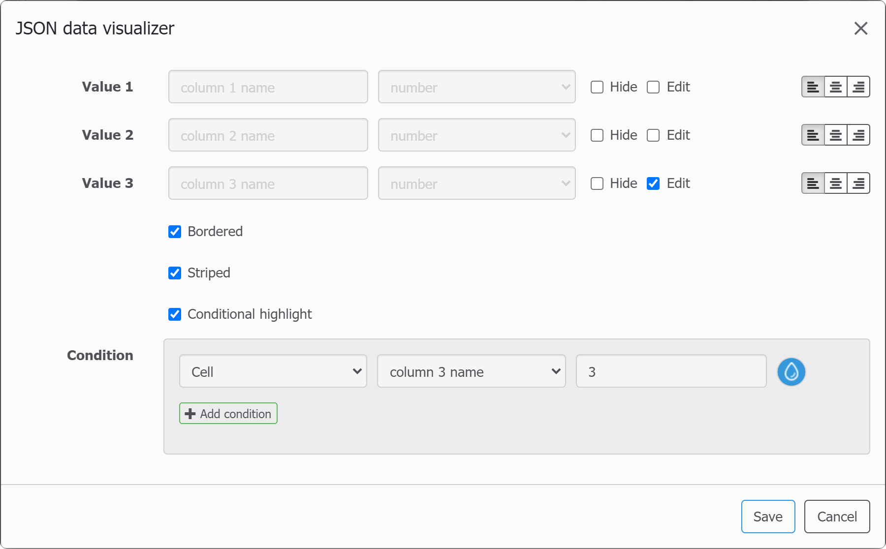
After you select right register, the following dialog will allow adjusting json element appearance:
You can also highlight the cells or rows with highlight rules:
Screen display on the mobiles devices
When viewed on mobile devices with a small screen, the visualization elements – widgets, menu items and other window elements are automatically redistributed, grouped into tabs, which can then be scrolled the usual way for mobile devices.
