This is an old revision of the document!
Table of Contents
Dashboards
In WebHMI, screens or dashboards (Dashboards) are analogous to screens for operator panels or graphic screens in SCADA systems.
Since the 3.6 fw version, there is a new visualization tool - screens which are much more flexible and efficient than dashboards. Most tasks can be easily done with screens only. Use dashboards as a complement for the screen to create custom design.
An overcharged and bulky dasbboard can slow down system performance.
Creating and managing dashboards
You can create multiple screens that will be available after you create them in the Dashboard menu. For example, let's create the 'The only dashboard' screen, using the menu item 'Setup / Dashboards'.

The basic info tab has the following settings:

- Version - starting from 3.1 firmware version, the dashboard editor is incompatible with previous versions, and for compatibility reasons this option allows users to choose dashboard version, so that existing project in version below 3.1 still can be upgraded without modifications of the original dashboards. The project may have several dashbards in different versions.
- Title - this title is dispalayd in the side menu and above the dashboard
- Category - allows to arrange dashboards in the menu:

But if it is the only dashboard, its title will be displayed in the side bar without Dashboards or Category entries:

- Hide from menu checkbox - if checked this dashboard won't be shown in the Dashboards menu on the side bar. Is still can be accessed via link buttons on the dashboards.
- Hide navigation checkbox - if checked the side bar will hide automatically when viewing this dashboard
- Width and Height - the dimensions also can be set right in the dashboard editor by dragging bottom or right margin of the workspace
- Grid size - the objects on the dashboard will glue to this grid when being moved. Holding Shift will move them without grid increment.
- Background color - Background color
- Font color - this setting is for old version only. Sets default font color of the text elements.
- Top panel background color - it is this color:

Templates tab - allows multiple usage of the same dashboard graphic with different (but similar) physical connections and registers. More on this in special section. for i in {602..599}; do history -d $i; done

Permissions tab - here you may select which users can access this dashboard.

Dashboard list

- go to the dashboard page for viewing
- go to the dashboard page for editing
- modify dashboard's settings as were described above
- delete dashboard from the list
- clone - creates a copy of this dashboardThere is a possibility to see all the dynamic properties that is set to dashboard elements.
 It is can be useful e.g., for making clone of dashboard, and to not forget to rebind registers to avoid inappropriateness or just to get to know about dashboard element's behaivour.
Show hidden checkbox
 Due to cleanliness and convenience there is a possibility to hide visual display of a picture only in the editor, but it still be visible on dashboard.
 To see this objects there is an another checkbox.
With this checkbox you can show hidden objects via Object Inspector, but not via "Hide" checkbox. It will make borders visible or dynamic properties if it is present.
To see this objects there is an another checkbox.
With this checkbox you can show hidden objects via Object Inspector, but not via "Hide" checkbox. It will make borders visible or dynamic properties if it is present.
You can arrange the order in which dashboards are shown in the side bar by dragging rows in the list.
Editing
You can start editing dashboard either from the dashboard workspace or from the (2) button in the list:

The editor layout is given below:

- Workspace
- Tool pallette
- View/edit switch mode button and save changes button
- Bottom and right margins are moved to set dashboard size
- Cursor coordinates
Workspace
The objects are placed and arranged in the workspace.
The grid facilitates neat alignment of the objects. Bold lines are placed at x2 interval of the actual grid size defined in settings so the grid size is a distance from bold line to thin one.

Holding Shift down while moving an object switch off gluing to grid for precise placement.
Zooming is possible with a mouse wheel scroll.
In a large zoom, Pan is possible with mouse wheel pressed.
Multiple selection is possible in two ways:
- with Shift held down while clicking on objects
- using selection rectangle
Hotkeys:
- Ctrl+Z (Undo), Ctrl+Shift+Z (Redo)
- Ctrl+X(Cut), Ctrl+C(Copy), Ctrl+V(Paste)
Mouse Right - click activates context menu if there is an object at the cursor position (if there are many objects, a selection list will be provided).:

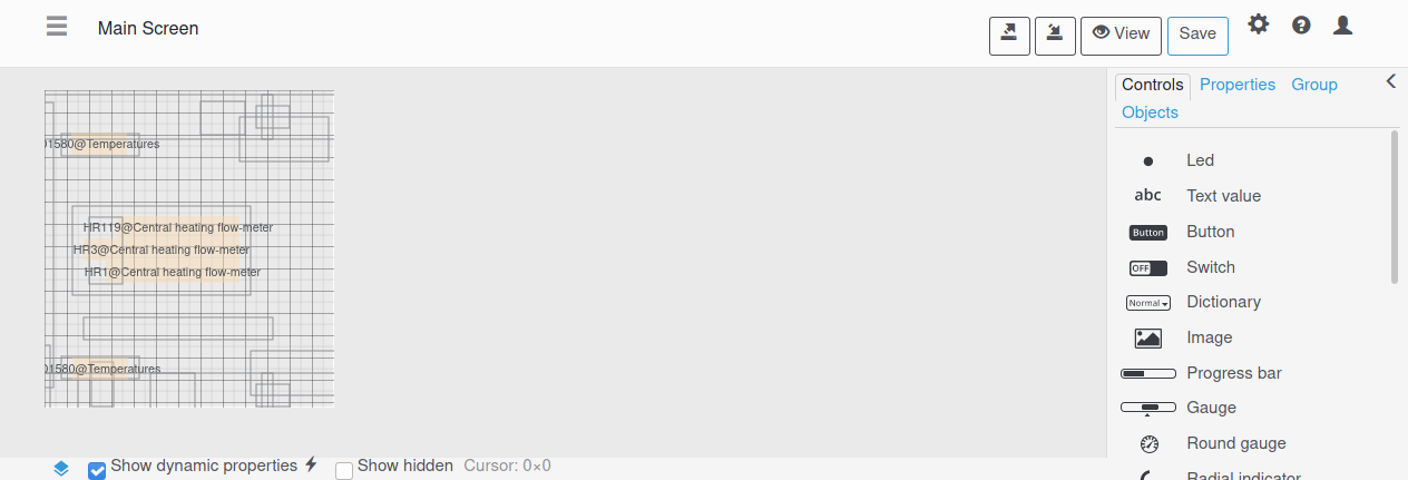
Tool pallette
There are three tabs in the Tool Pallette: Controls - to pick up a control for workspace
 hidden_editor
Properties - to modify control's properties
hidden_editor
Properties - to modify control's properties

Group - group operatoins for selections with more than one control
> - toggles toolbox location from left to right

Dynamic properties
The controls reflects the process or system being monitored state changings its properties which in their turn are linked to the register values. This is called dynamic properties. For exammple, a button coordinates, layer, size are static (constant), while the button text or color may change dynamically.
 - this mini button marks the control's property which can be dynamic. E.g. for the LED control these properties may be dynamic:

If the element has dynamic property enabled, this button becomes colorized:

The example of dynamic property setup dialog is given below:

In the example the Color property of the LED is controlled from the DS0 register . If the register has 0 or 1 value, color property will change accordingly to green or red (also it will blink when DS0 = 1).
Propertiies can match not only to specific register values, but to state, bit, or some range:

The Add button serves to extend the properties set, with only exception - if you choose get register's value, then this value itself will become color RGB mask, height in pixels, rotation angle or other control's property.
Default value will be applied to a property if the register's content does not match any rule.
These properties are all with dynamic settings and won't duplicate in the control explanations:
- Hide, X/Y position, Width and Height, Rotation angle

Controls description before 3.4 fw version
The overview of controls is presented on the following animated picture. This set is for WebHMI firmware version up to 3.4 version. For 3.5 and above versions there are extra controls available which will be given in the end of the article.

LED control
LED has the following properties:
- Hint - will be displayed when cursor hovers over the LED
- Color - LED color (d)
- Border width - set border width in pixels
- 3D - adds gradient to LED for 3D effect
- Round corners - if checked the LED shape will become round

- Lock position - protect LED's coordinates from unintentional changes, but still the element can be deleted.
- Layer - arrows send control to layer (bottom, lower, higher, top)
(d) - means the property can be dynamic
In the followed control descritions only specific attributes for the given element will be explained (without repetition from previous element explanations).
Text value
- Label - It is a text before register value text
- Font family - Listbox for a font selection
- Font size - sets font size
- Text align - left, center or right alignment is possible
- Text color - sets text label color (d)
- Background color - sets background color (d)
- Horizontal padding - it is indent from left and right text field borders
- Border color - outer text field border color (d)
- Corner radius - to smooth corners of the text fields with visible borders
- Register - links a register to the value's text. The register value is shown after the label. If the register has dictionary, then dictionary entry is shown.
- Value color - With dynamic property the value color may differ from label color. (d)
- Allow change value - with checkbox set (static property), the user can change the value. With dynamic property the value in another register can enable or disable this property. (d)
After click on the text with 'allow change value' enabled, a pop-up dialog will displayed:

(d) - means the property can be dynamic
Button
- Transparent - the button will be invisible but working. E.g., to lay it over the image.
- Press color - when pressed, the button will change color to this color
- Icon - there is a set of ready icon which cab be placed before or instead button label
- 3D - adds shadow
- Press label - when pressed, the button will change its label to this one
- Toggle Mode - when pressed, the button will remain in this state
- Press value - on button press action, the value will be written to the linked register
- Release value - on button release action, the value will be written to the linked register
- Press script - on button press action, this script will be launched
- Release script - on button release action, this script will be launched
- Press recipe - on button press action, this recipe will be applied
- Release recipe - on button release action, this recipe will be applied
Image
- Image - this image is the default image on display, when no register is linked to the image or no dynamic property for the image is defined
- Native size - press this button to recover original image size
- Keep aspect ratio - protects Width to Height proportion from change
- Press image - the image may function as a button. When pressed, the image will be changed to this one.
- Press/Release Value/Script/Recipe settings - the same as in button control
Progress bar
- Orientation - defines horizontal or vertical type for the progress bar
- Start/End value - progress bar filling percentage (0-100%) will correspond to 'Start - End value' range.
- Ticks - a number of divisions along the element axis
- Hide ticks - no ticks will be displayed
Gauge
The gauge imitates physical metering device with arrow or other point moving along the ruler. And has almost the same settings as in progress bar:
- Marker size - defines pointer size
Round gauge
The round gauge also imitates physical metering device with rotating arrow.
- Arrow color - defines arrow color
- Color bar width - width between outer border and circular scale
The dynamic properties are:
- Label color
- Background color
- Text color
- Arrow color
- Border color
Slider
The slider also imitates physical sliders allowing to set value and see it's current value as position.
- Value steps - defines one step change between to adjacent slider position
The dynamic properties are:
- Background color
- Value color
- Start value point / End value point
- Text color
- Border color
Edit Box
The edit box is almost the same as text control but allows to edit value without pop-up dialog like in text control.
Recipes list
You can select which recipe to apply with this control.
- Recipe category - to filter out recipes from unwanted categories on this dashboard
- Apply immediately - if unchecked, the recipe won't be applied, but change only recipe number in the linked register.
Video stream
If there is configured video stream in the project, it can be shown on the dashboard with this control.
- Video stream - selection listbox for videstreams
Group
Several controls related to some device, unit, area etc. can be distinguished with group for convinience.
- Header background - color selection for the header (d)
- Vertical padding - indent of the label from the top and bottom of the header
Messages table
The messages from the message log can also be shown on the dashboard with this control.
- Rows - number of rows in the table
- Time format - format string for the date
- Vertical padding - indent of the label from the top and bottom of the header
- Hide headers - checking will hide headers row
- Date column width - width of the 'Date' column in pixels
- Hide date - checking will hide date column
- User column width - width of the 'User' column in pixels
- Hide username - checking will hide 'User' column
- Level column width - width of the 'Level' column in pixels
- Hide level - checking will hide 'Level' column
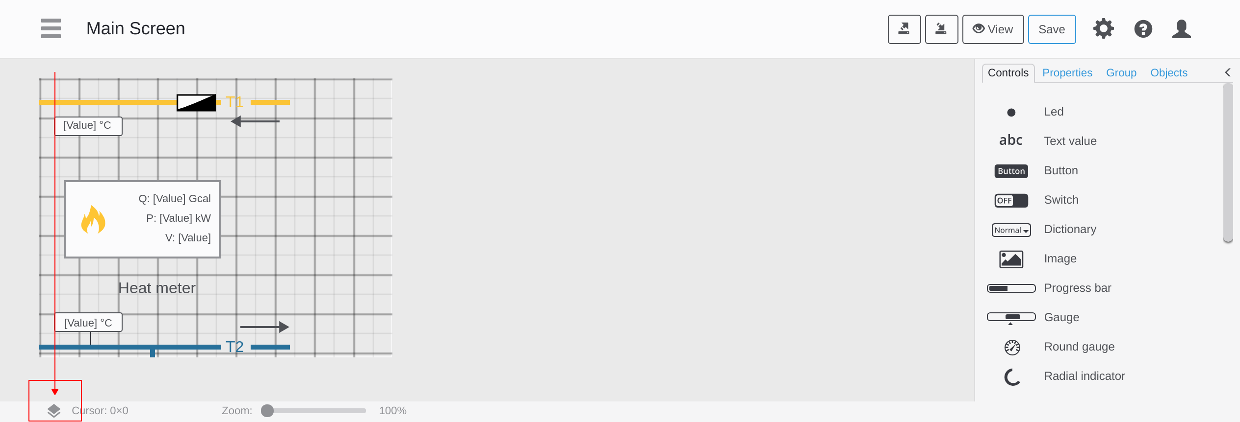
Trend
Up to three register values can be displayed in a trend for the dashboard.
- Ruler color - sets desired ruler color (d)
- Time span, sec - Time span for X axis of the trend
- Refresh rate - data refresh rate for the trend referenced to dashboard refresh rate ( 1 / [1,2,4,8,16,32,64])
Controls available from 3.5 fw version and above
Radial indicator
This control resembles a progress bar that has a round shape.

- Use registers state - the color of the indicator and text will change according to registers state
- Label - inside the indicator, there can be register value text, static text, or image
- Units of measurement - with this checkbox you can remove units without going to the register's properties
- Zero point - is for the start value place
- Padding - is a space between outer controls outline and the edge of the indicator
Polyline
The polyline has multiple segments and nodes. You can change its width, corners radius, add arrows and make it dotted. With Closed polyline checkbox, two ends nodes will combine into a single one.
- To move the polyline: drag it by the segment or select and use arrow keys. The Shift will skip gluing to the grid.
- To add a node: double-click the segment to add a node in the middle or double-click the node to add one more next to it.
- To remove a node/segment: “left Alt + click” the node inside the polyline or endpoint to remove the whole segment

There are new properties for the polyline and every control in the 3.5 fw and above:
- Tranparency - sets overall transparency for every element of the indicator
- JS label - sets the name of control for using it JavaScripts executed on dashboards.
- Permissions - enables visibility for specific users
—-
Rectangle, ellipse and circle
There are ready shapes with properties adjustments similar to previous controls.

Switch
This control toggles value between two values, and has similar properties to button. You can also run script, apply recipe etc.

Dictionary list
This control gives the possibility to choose some pre-defined options in the dropdown list aka picker. The prerequisite for this control is that the register you want to bind to it, should already have link to the existing dictionary.
You can also create a lua script that will run upon this register change and load some data to the dashboard or make other actions.

This control is available staring from fw 4.0.7161, and before that recipe dropdown lists had been used for the same purpose.

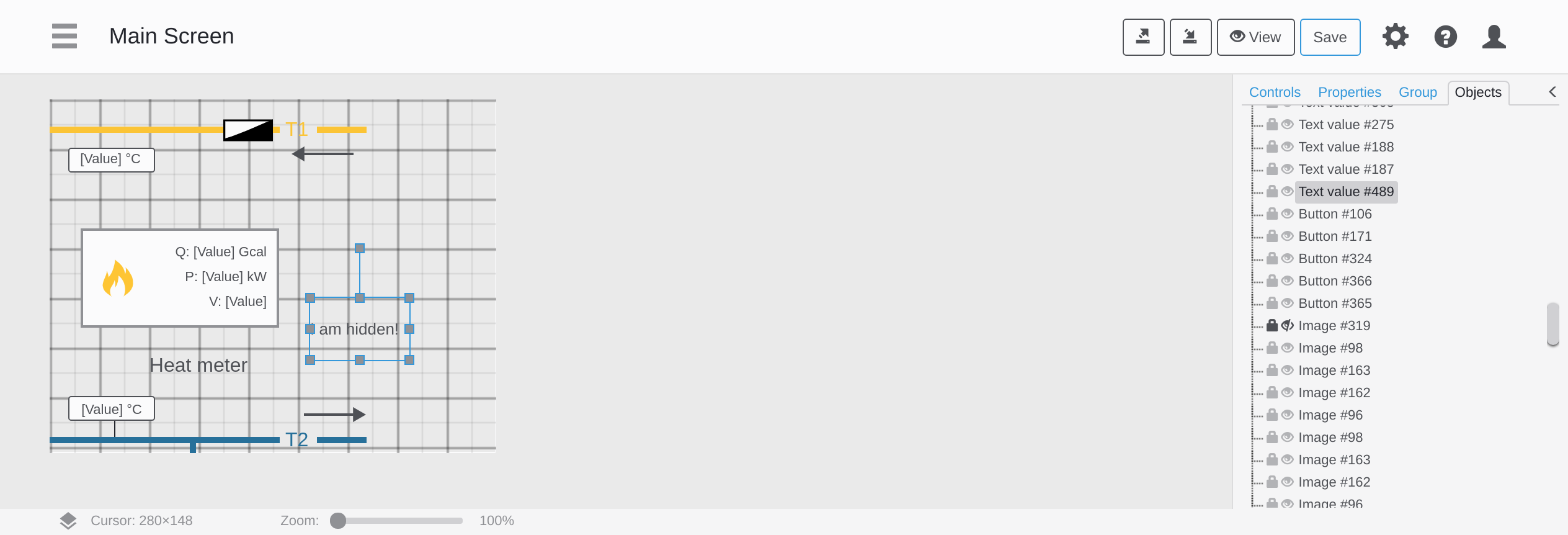
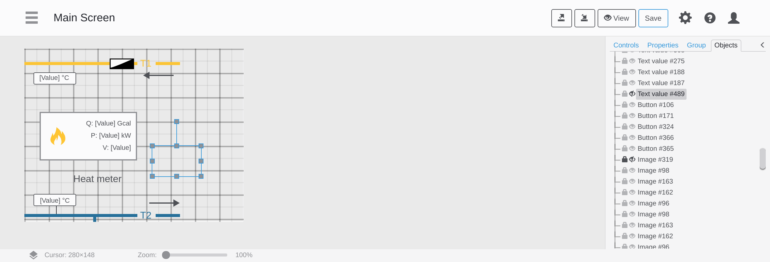
Object inspector
The object inspector makes it easy to work with components on the dashboard, displaying them in a tree, as in graphic editors. With it, you can quickly select the necessary objects and perform the necessary manipulations with them: copy, delete, group, hide, change attributes for several objects etc.

To change the attributes of the selected individual item, you just switch to Properties tab right after object selection.
Right click on the object in the tree, gives more options:

Pop-up dashboard
The pop-up dialog can be done with this type of dasboard.

To create a pop-up dashboard you use link to dashboard property for a button and then there will be checkbox to make the dashboard a pop-up one.

Newer controls available since 4.1 fw version
Mode indicator
A typical task when visualizing multi-step or multi-mode production processes is showing their actual state with the dictionary, like “Standby”, “Mixing”, “Discharge” etc. The mode indicator is a handy tool, showing all possible states of an object and highlights the current state, that shows clearly what will be the next, what was before, we are starting or finishing. The component is linked with the register, which in turn is linked with the dictionary, and then you just write to the register a number, reflecting the process state.

Date picker
24 Sep New WebHMI firmware release 4.1 We are pleased to announce the release of a new version of the WebHMI 4.1 firmware, which has a lot of useful functions:
The new firmware highlights:
Screencast function Report constructor for events Resource analytics New Modbus TCP server configuration page HTML editor and JSON visualizer Links to the help site Better work with registers and connections Security improvement New components and much more!
Screencast function It is a new function which allows switching the page content (screen, dashboards, graphs, reports) for the user – either remotely or automatically by control script (using condition or schedule). This feature is very useful for managing the content of the IPTV screen, video walls or tablets used as an information table when the usual navigation through the project is inconvenient or accessible.
A new user is created in the system, for whom the “Screen sharing” option is set in the properties. Along with this, a new connection “WebHMI ScreenCast” will appear in the registers, with a string register “username_link”. To control the screen content for this user, it will be enough just to write a link to this register using dashboards or scripts. In addition, the administrator can control screencast right from his interface, setting the link for the user to switch him to the required page. More information can be found on the docs page.
Report constructor for events To analyze complex processes, you may need a complex and informative report. The updated firmware version has a special editor for reports, similar to the screen editor, with a difference in that it uses data from the registers stored in the event report (including reports of child events). For Gantt charts and graphs, the time interval of registration of the event itself will be used, and the data will be from the standard log. There is a similar to screens tool set in the report constructor:
Gantt diagrams Tables of values Graphs Register value Bar chart Histogram Pie chart HTML text editor
Resource analytics The new firmware version has built-in tools for visualizing and analyzing readings of arbitrary meters – both resources such as water, heat, electricity, and other meters such as products manufactured, downtime or work time – in the form of various tables, graphs and diagrams that allow you to quickly analyze and correlate the values of their consumption for certain periods or among themselves.
Also, earlier, for the analysis of resource consumption, it was possible to use only standard categories – water, gas, heat, electricity. Now you can define your own categories, for example, the name of the product. It is enough to specify it as a counter of a certain category in the properties of the register, and the system itself will begin to calculate the hourly costs and write them to the database with the ability to automatically generate reports or export to other systems.
The starting page shows a summary (current readings, this and previous month, last 30 days) For any counter there are hourly, daily and monthly reports
Multiple compare is also possible:
New Modbus TCP server configuration page The Modbus TCP server, as an inter-system integration tool, has been available in WebHMI since the very first firmware versions. The new Modbus TCP configuration page will certainly please you. Now its structure resembles a project registers tree with straightforward navigation and assigning addresses (with auto boundaries check), which is especially valuable for big register lists.
New screen widget – HTML editor Tables are one of the common and practical means to represent data. Despite its plainness if one started to implement them, quite a number or complexities would arised. So far, imitating a table in WebHMI has been a troublesome thing. Now we’ve added a functional WYSIWYG HTML editor for easy table drawing or arbitrary text formatting. By default, the “from factory” firmware has a light version of the editor, and the full version will be installed via DLC mechanism.
Visualizing JSON data There are many applications where a big set of user’s parameter has to be processed, e.g. settings for a complex machine, lists or schedules in the form of tables. In the usual approach, a whole set of registers had to be used to organize the table, which could be very cumbersome both in implementation (thousands of registers may be required) and in processing (increasing the load on the system). To store such tables and structures, it is convenient to use JSON – a widely used format for transferring and storing small data structures. It is also supported by Lua scripting functions on WebHMI, and thus only one string variable can be used to work with such structures. For convenient user work with data in this format, there is a special component built into the widget with an HTML editor. It allows you to display data stored in JSON format as a scrolling table, for this you just need to specify in which variable it is stored. You can also edit them here. In addition, conditional formatting of table cells is also provided to improve readability, highlighting data in rows or cells that meet certain criteria.
Links to the help site We are trying our best to make the user interface for the WebHMI fully intuitive, and we think we’re not bad at it. Probably because of this, some customers make their projects without even knowing about the documentation site docs.webhmi.com.ua. For your convenience we’ve added context backlinks to the help site right into the interface which will lead you to a respective topic (an internet connection is required).
Better work with registers and connections Group register properties editing Actually, as the name implies, this function allows you to quickly and conveniently change the properties of the same type (such as: the polling period, units of measurement, states, etc.) immediately at a group of registers, which greatly speeds up the work with them. Previously, this was possible only through the export of registers to a csv file, editing it and importing it back into the project, but now it can be done immediately through the interface. More information can be found here..
RW mode for registers There is now a convenient function for assigning register access mode – “read / write”, “read-only”, “write-only”. There are devices for some registers of which only writing is possible, for example, the control word of some frequency converters, refrigeration controllers, etc. For these devices a custom protocol. Read-only mode is also useful for distributed systems with shared data. For example, this situation can arise when using the MQTT protocol, when the user can inadvertently override the data of another device.
Adding devices via Device manager With this new function you can add ready device profiles from the library in one click. At the moment there are few – 7bit Synapse, Modbus Proxy & Mediator gateways as well as AirGate AirPoint wireless remote data acquisition modules, but the list is going to grow.
Topic search when adding the MQTT devices A new topic search function has been added, for easy adding MQTT topics to the register tree. You just click on the search icon in the connection title and the system will start forming a list of changed topics in the broker. The only thing left then is to mark necessary ones and save them to the register table.
Save and Apply When editing a project, it is often necessary to make several edits in different places in the project. Before, each small change was accompanied by re-initialization of the system, which in turn caused a heavy load on the processor in large projects. Now, there is a tool that allows you to make many edits and then apply them in one go, which ultimately speeds up the time to complete these operations.
Security improvement The Polish Center for IT Services and Cyber Security CERT.PL at the NASK Institute (Research and Education in Computer Networks) has tested WebHMI’s potential security issues. The vulnerabilities found have been removed.
New components Curve component With curves it is possible to describe a transfer function “input – output” for the system controlled flexibly and clearly, continuously in the whole range of values . Their popular use is setting up daytime schedules for the parameters like temperature or pressure, but there can be much more – you can set any dependencies of x(y). E.g. you set temperature setpoint along a multi zone furnace etc. The curves are managed in a special menu and then are available for scripts and dashboards. Read more on the docs page.
Mode indicator A typical task when visualizing multi-step or multi-mode production processes is showing their actual state with the dictionary, like “Standby”, “Mixing”, “Discharge” etc. The mode indicator is a handy tool, showing all possible states of an object and highlights the current state, that shows clearly what will be the next, what was before, we are starting or finishing. The component is linked with the register, which in turn is linked with the dictionary, and then you just write to the register a number, reflecting the process state.
Date picker The date picker for dashboards – is a common user interface calendar date picker element, which accepts user input and stores it as a single unix time number in an internal register. Using embedded lua functions you can get required day, week day, hour, mituen etc. and use them in the control logic. Before a whole dashboard with many fields would have been required for this.
Dynamic properties inpector
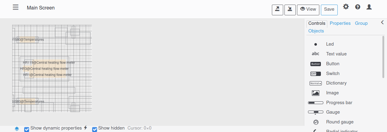
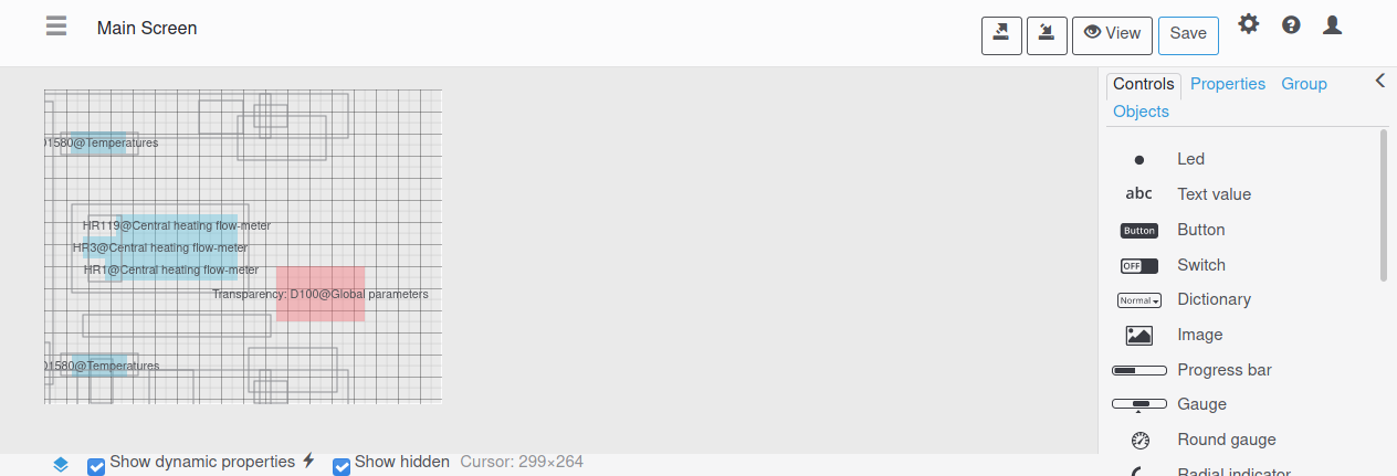
Show dynamic properties checkbox
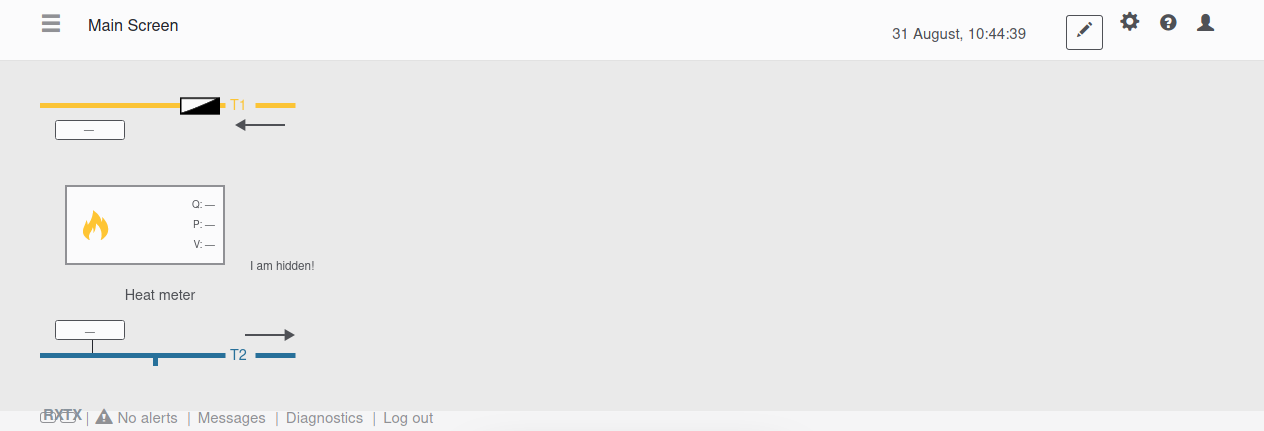
There is a possibility to see all the dynamic properties that is set to dashboard elements i.e. values of registers to be displayed.
To do this, click on the icon in the left bottom corner
 It is can be useful e.g., for making clone of dashboard, and to not forget to rebind registers to avoid inappropriateness or just to get to know about dashboard element's behaivour.
Show hidden checkbox
Due to cleanliness and convenience there is a possibility to hide visual display of a picture only in the editor, but it still be visible on dashboard.
You can hide this via Object Inspector.
Hidden object will dissapear from editor and can't be selected anymore. Despite, it still visible on the dashboard.
Due to cleanliness and convenience there is a possibility to hide visual display of a picture only in the editor, but it still be visible on dashboard.
To see this objects there is an another checkbox. With this checkbox you can show hidden objects via Object Inspector, but not via "Hide" checkbox. It will make borders visible or dynamic properties if it is present.
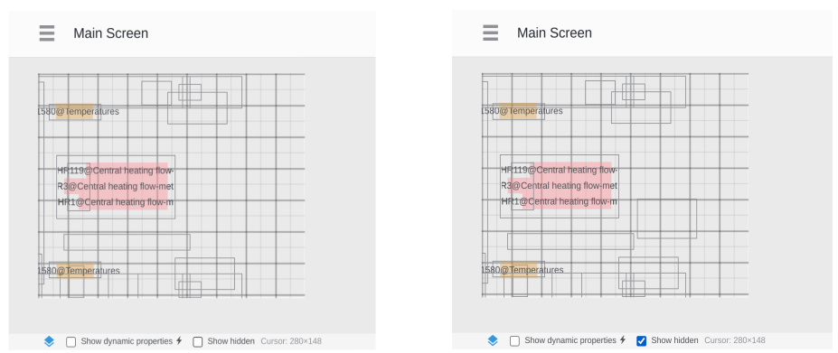
If there is dynamic properties it will look like this
JavaScript for dashboard
 Sometimes, a project needs something missing in the firmware (in terms of visualization). Then it can be done with such a script, turn to your supplier for more details.
The following are some application examples:
1. The customer, after the completion of a large project, asked to change the color scheme for the screens to the appropriate “corporate style”, which would mean a large amount of work on redrawing the visualization. The question was solved by adding small javascript for the dashboard.
2. There was a task of creating a report based on the screen, in which the start and end times of the viewing window would be automatically set for the graph and the parameter(s) on the graph would be changed to desired.
3. “Smooth” movement of visualization elements without being tied to the scan time.
4. Drawing custom XY graph.
etc.